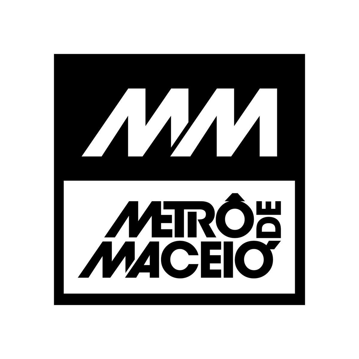
Metrô de Maceió
(Maceió Subway)
Maceió is my hometown, in the Northeast of Brazil. It grew fast, going from around 400 thousand inhabitants in 1980 to over 1 million in 2015. The bus system can't assist everyone and the number of cars have increased affecting traffic badly. Every time I go back home to visit my family the issue seems to aggravate, impacting not only the traffic, but taking a toll on the environment as well. I developed an initial concept for a subway system with 12 lines that would cross the whole city providing new mobility options. Once it is a very touristy destination, it would greatly benefit from a fast and reliable public transportation system.
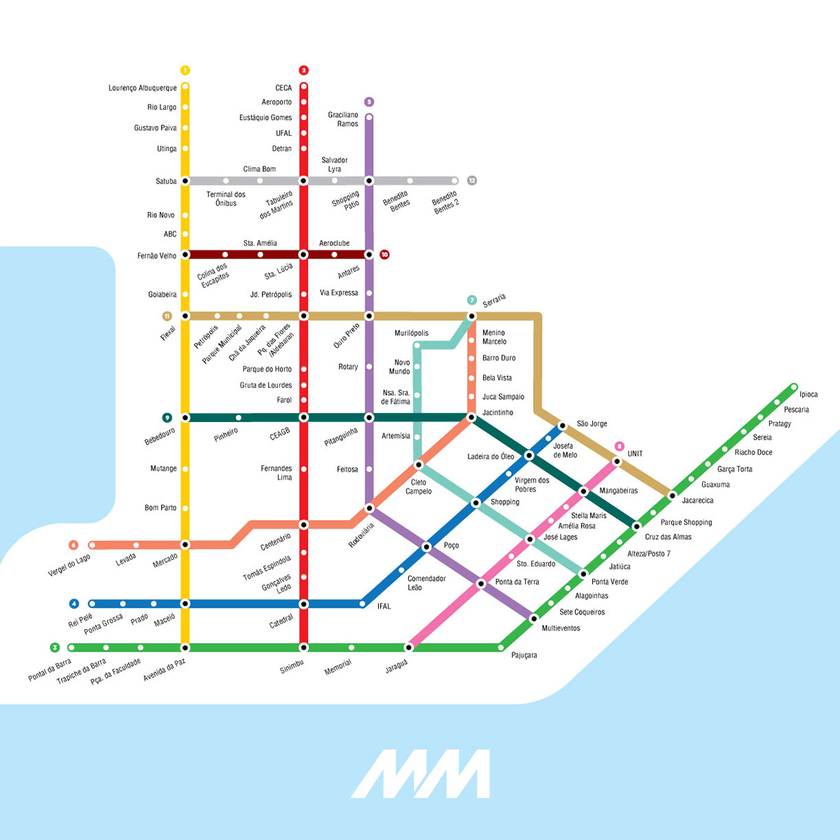
Logo and lines map
I decided to use the typeface Avant Garde because subways are perceived as a modern and cosmopolitan form of transportation, and a sans-serif geometric font transmits that feeling well. Maceió is also known for its beaches and "jangadas" (fishing sailing rafts), so the leaning uppercase MM shapes in Avant Garde are meant to represent both the boats and the waves of the ocean. All the supporting text uses Franklin Gothic.
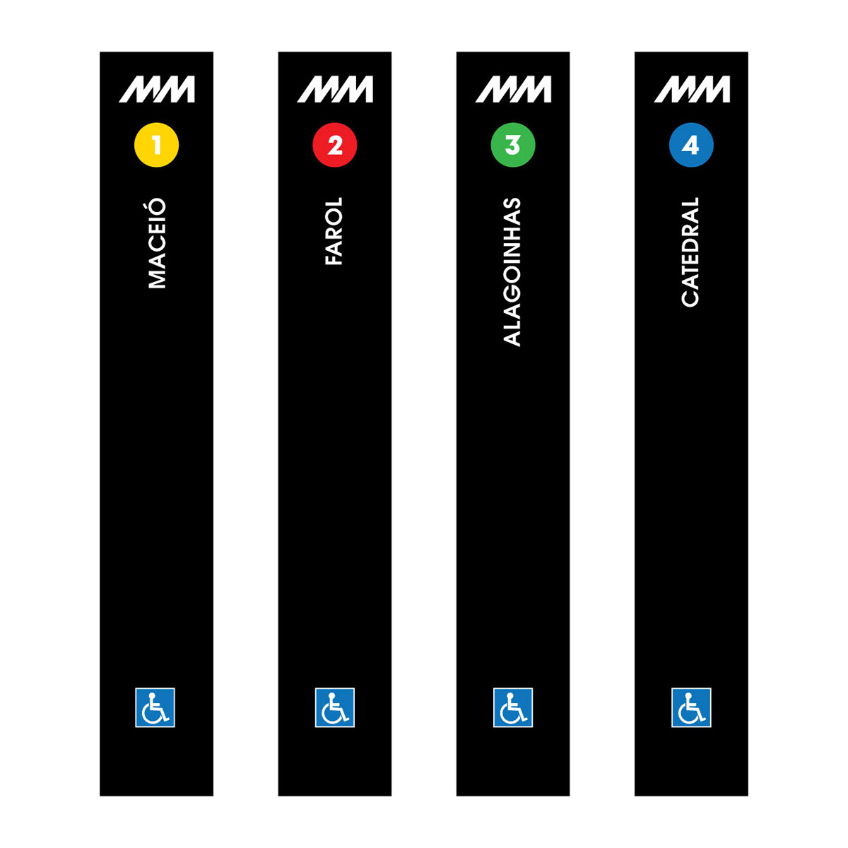
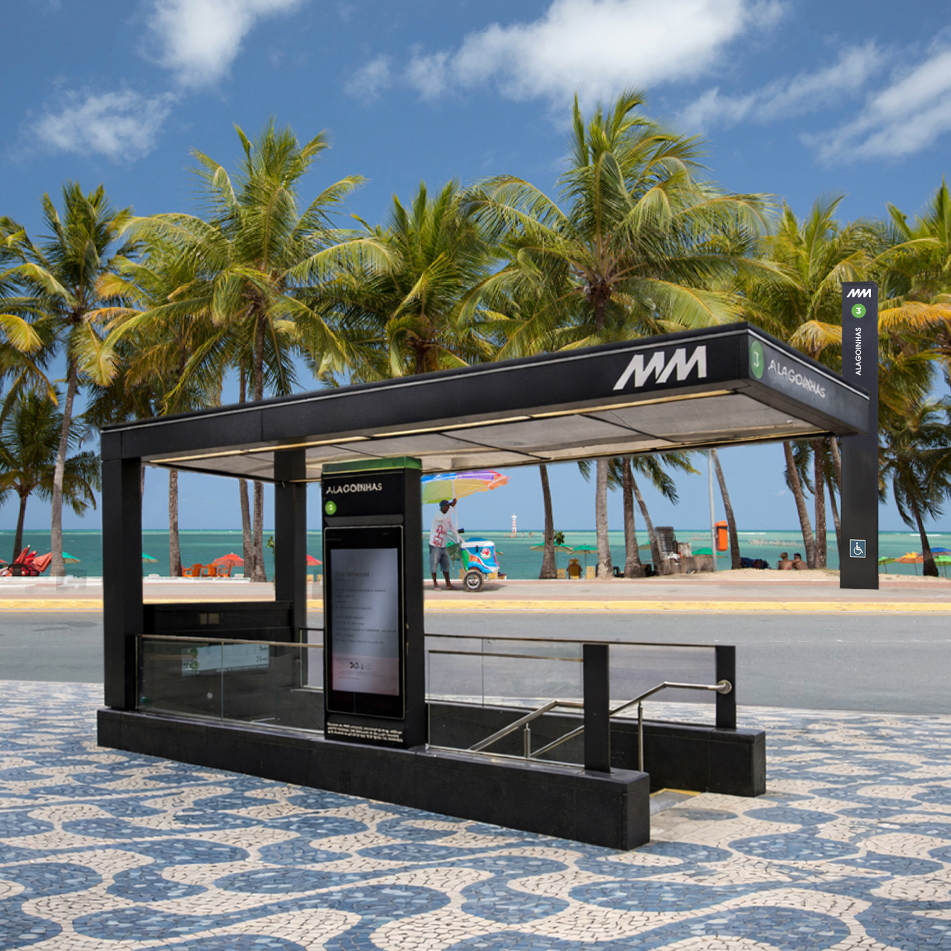
Street signage posts and station entrance simulation
The main colors used are black and white. Once the subway lines are diverged by colors, all the rest must be very simple and minimalist to keep the design easily understandable and straight forward.
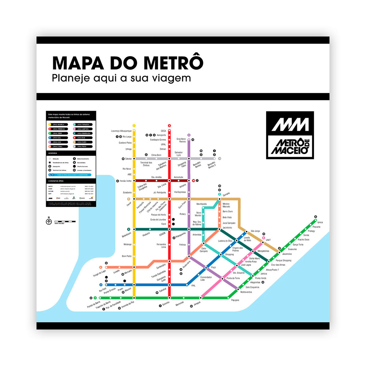
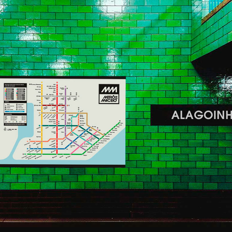
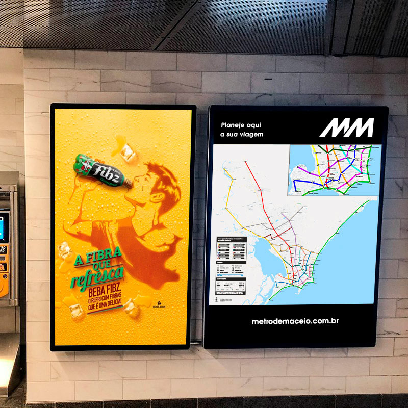
Subway style map with icons, legend and contact information.
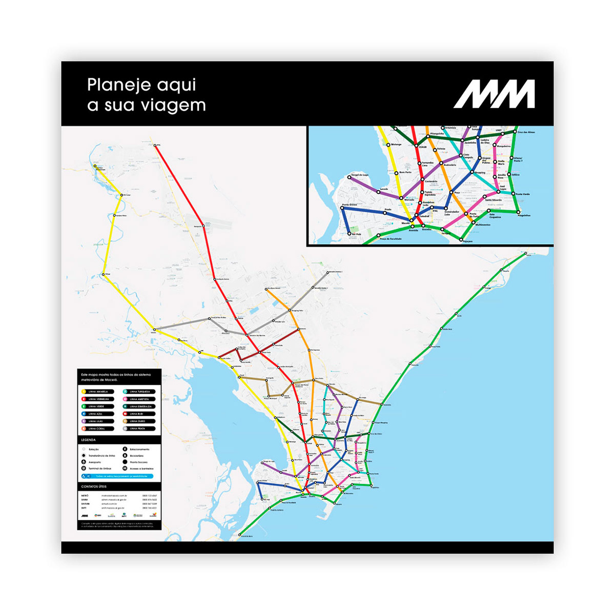
Street map with subway lines accurate locations and downtown amplification.
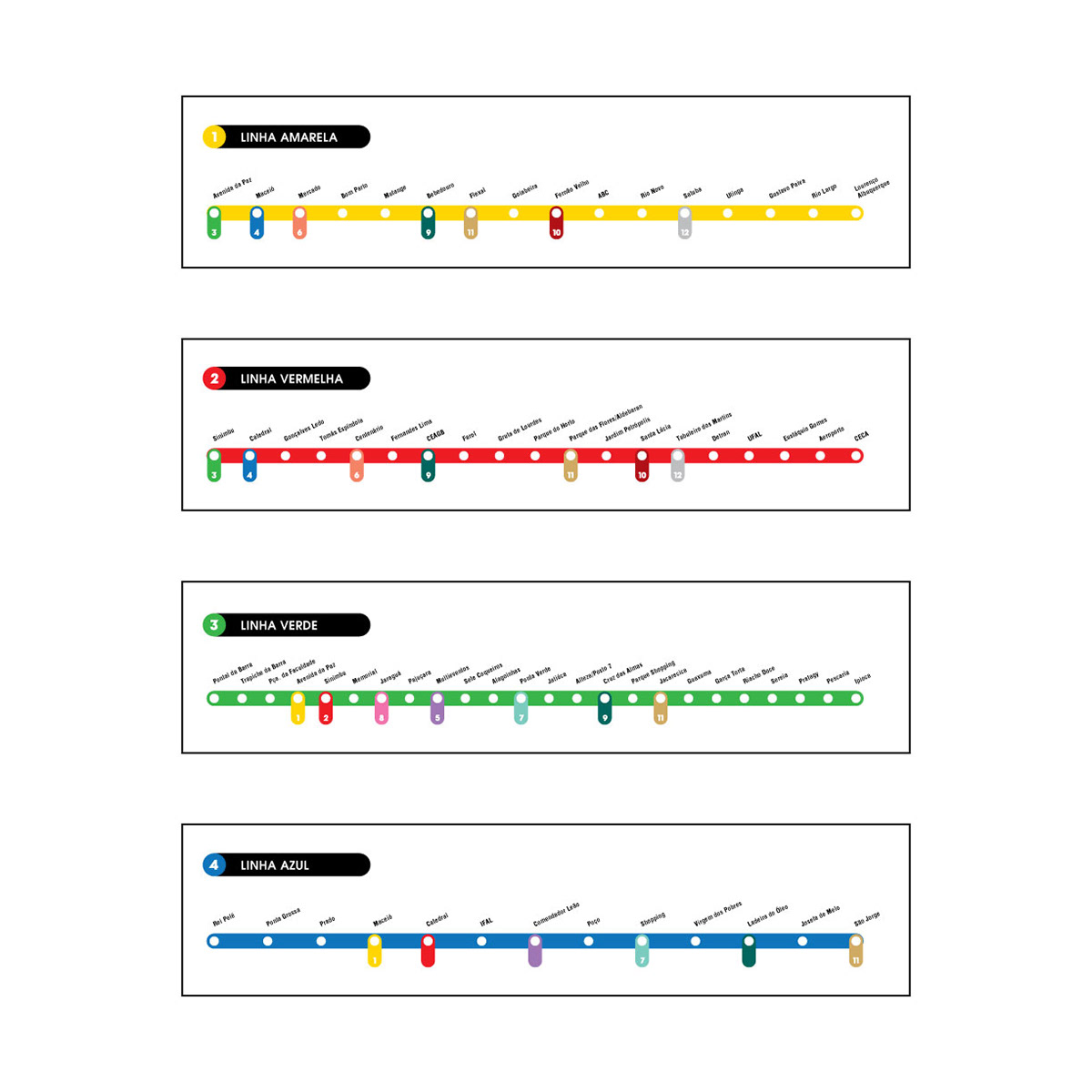
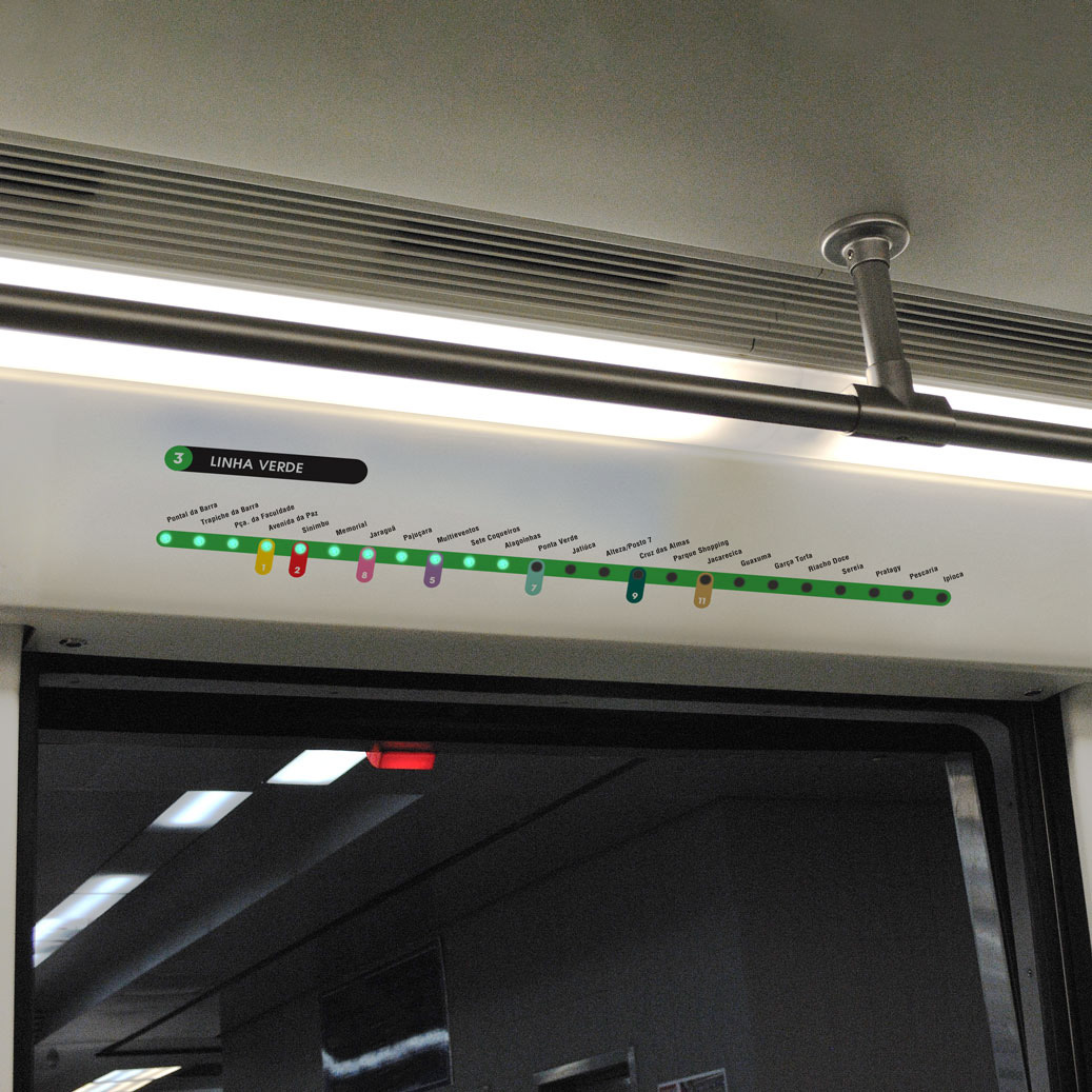
Line maps inside trains
All the graphic compositions and iconography were created on Adobe Illustrator.
Mock ups done on Adobe Photoshop.