
IE - Intercâmbio no Exterior (2006/09)
IE is one of the most important cultural exchange programs agencies in Brazil. It was my first design job in which I started as a graphic design intern in the Marketing department in May 2006 until December 2007, when I traveled to Hawaii to work as an exchange student. The company offered several work and study programs all around the word, and all those programs had their own branding apart from the company's standard visual identity.
My responsibilities then were to assist the lead designer creating the necessary new material (flyers, newsletters, banners, etc.) and updating content in the webpage.
I returned to IE when I arrived back in Brazil in April 2008. Upon my return I was promoted and became the agency's lead designer. My new responsibilities were to brand all the company's program (generally annual or bi-annual updates), updating the websites layout, and managing the company's visual identity.
Below I show some of examples of my work at IE.
Work Experience USA 2008/09
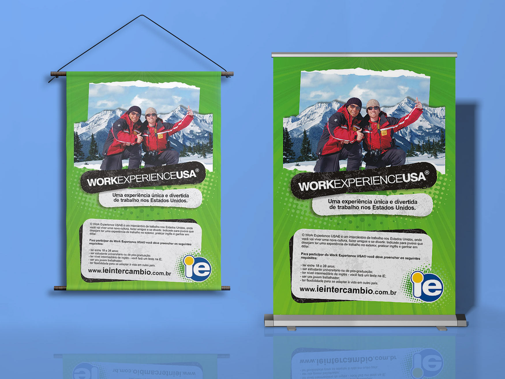
Banners
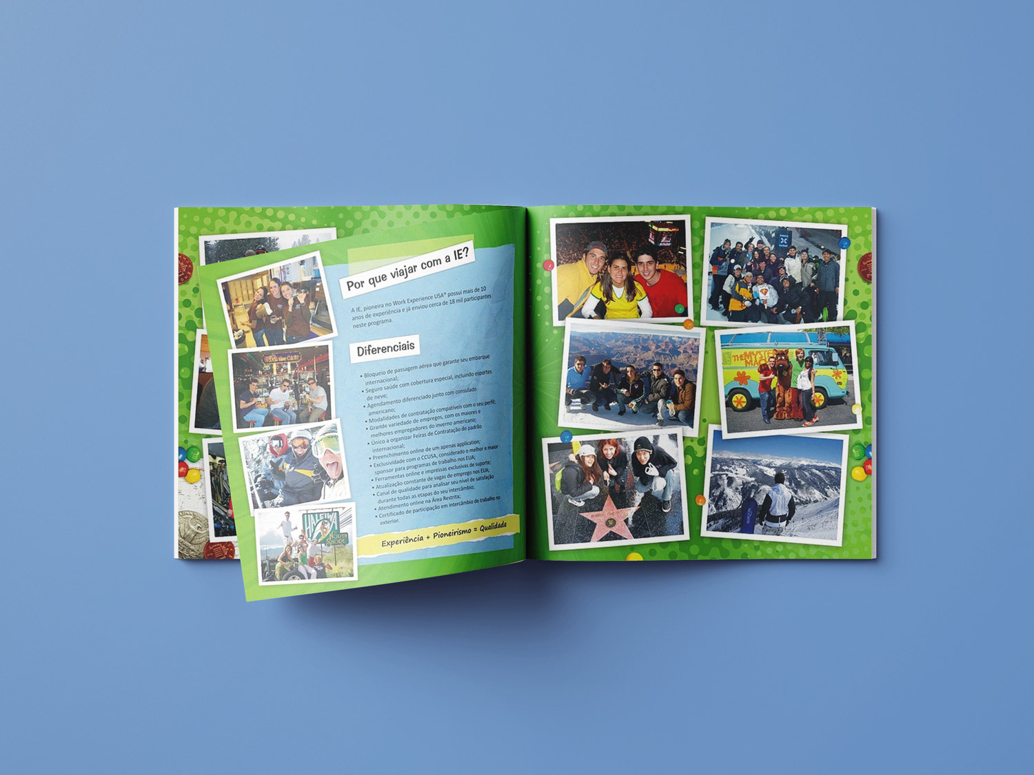
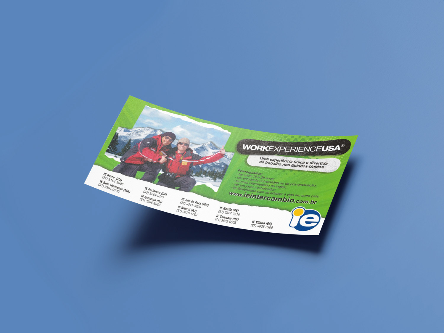
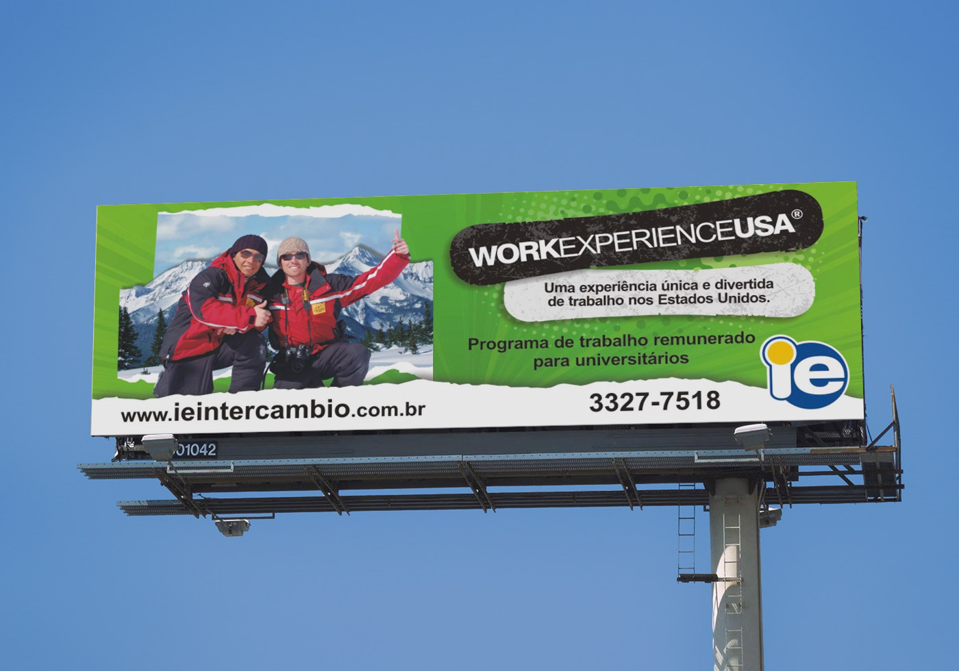
Work Experience USA was the company's main program, where college and university students would travel to anywhere in the USA to work for a few months during the winter break. Its campaign changed every year, as clients would sign up all around the year to board at the end of the year. It's main color was always green, and it required a young and vibrant approach to appeal its target audience.
My idea for that year campaigns was inspired in travel diaries and albums, and cork murals, using elements common on them, as post-it notes, cropped pictures, collages, etc., and usual travelling souvenirs such as candy, coins, snow globes, stickers, magnets, postcards, license plates, etc.
The main pieces required for the campaign were the hanging banner/poster (for events and lectures at schools), booklet, flyer handout, newsletters, street billboard advertisement and a slideshow for in-store presentation. The campaign always required other specific pieces that would be developed as the need emerged.
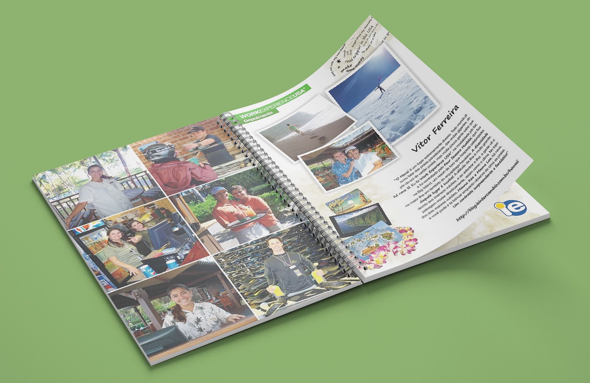
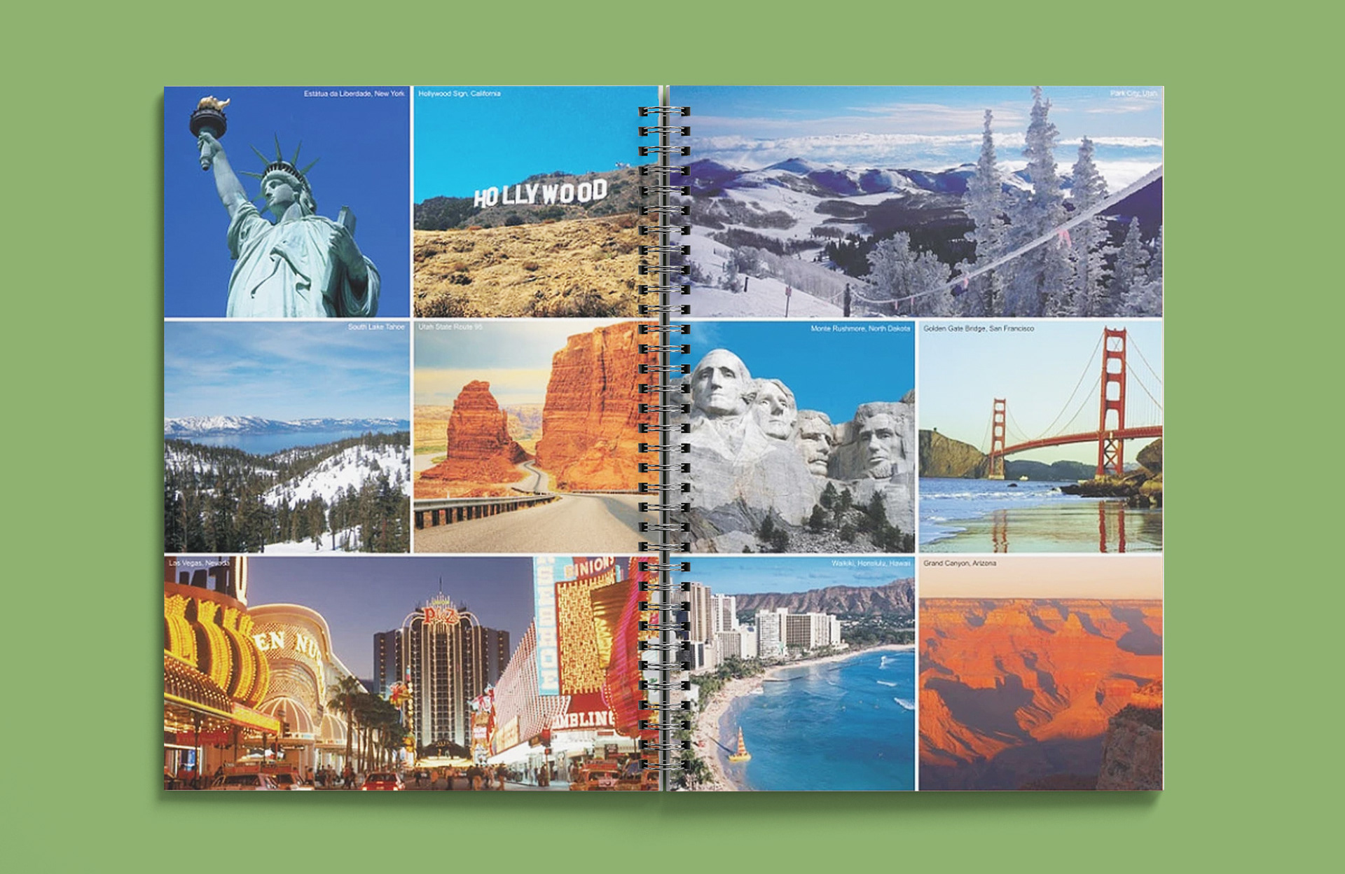
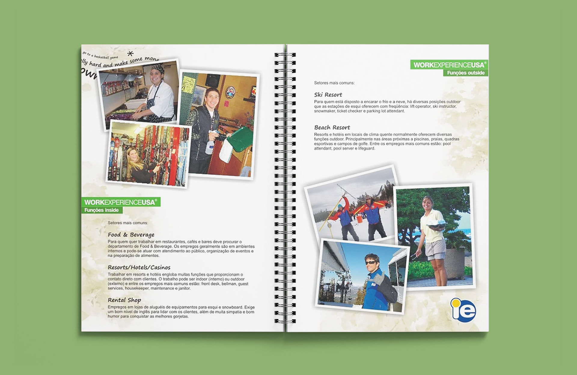
The pictures used were always provided by the previous years participants, portraying their work and leisure moments during the program.
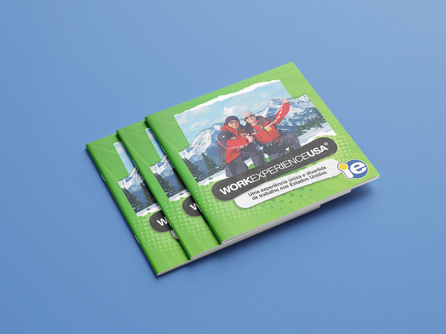


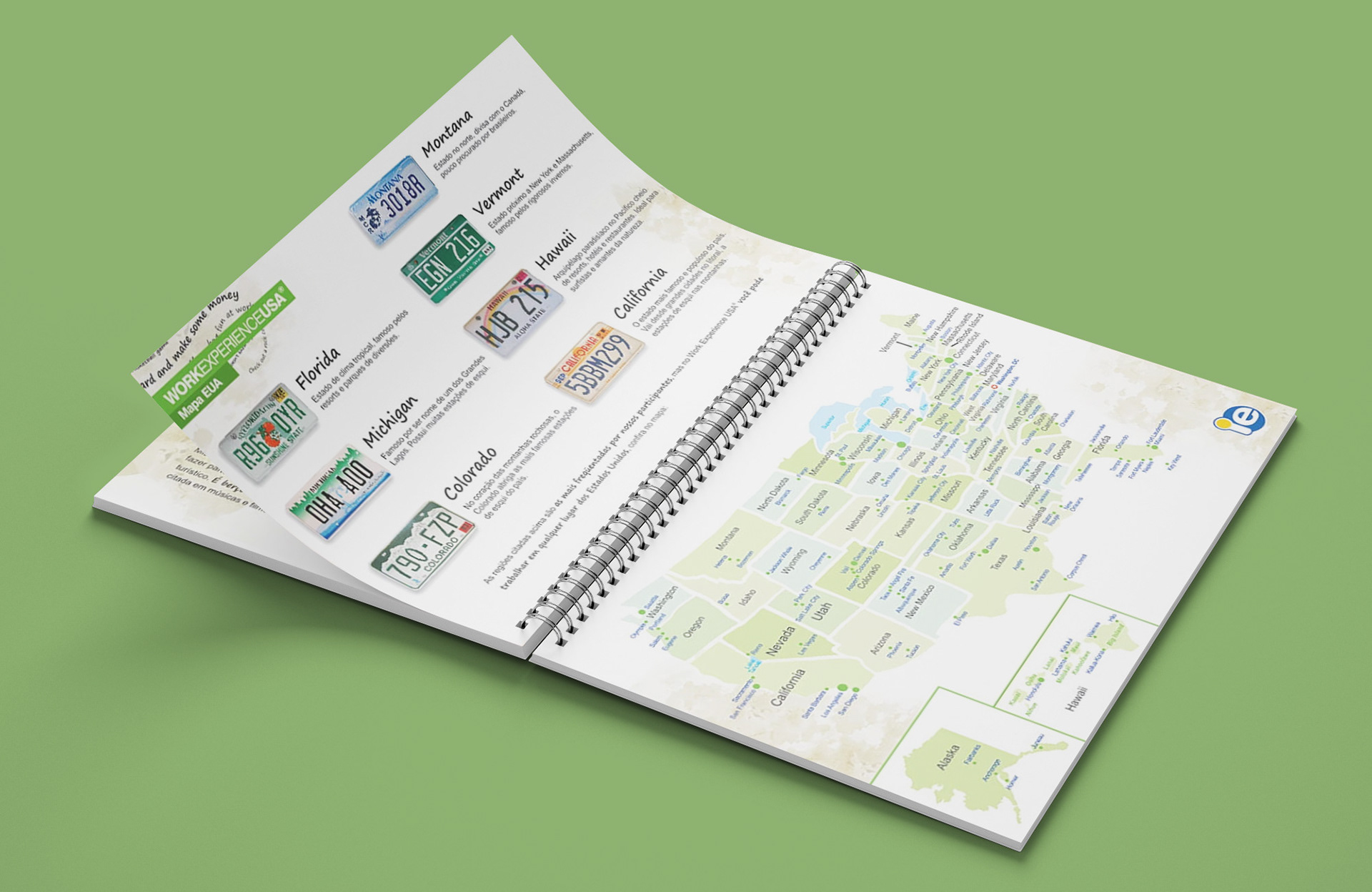
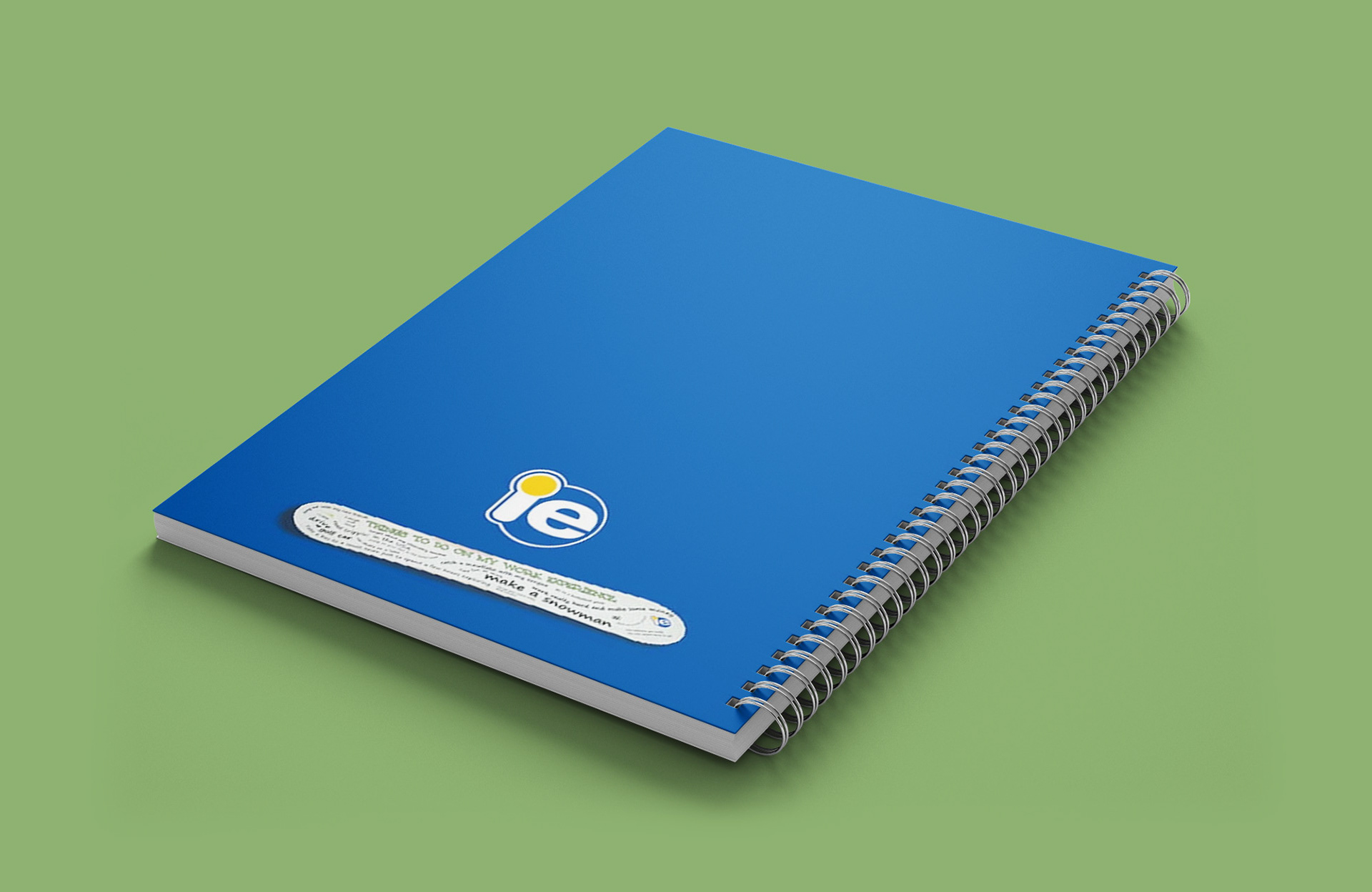
IE Book (2008/09)
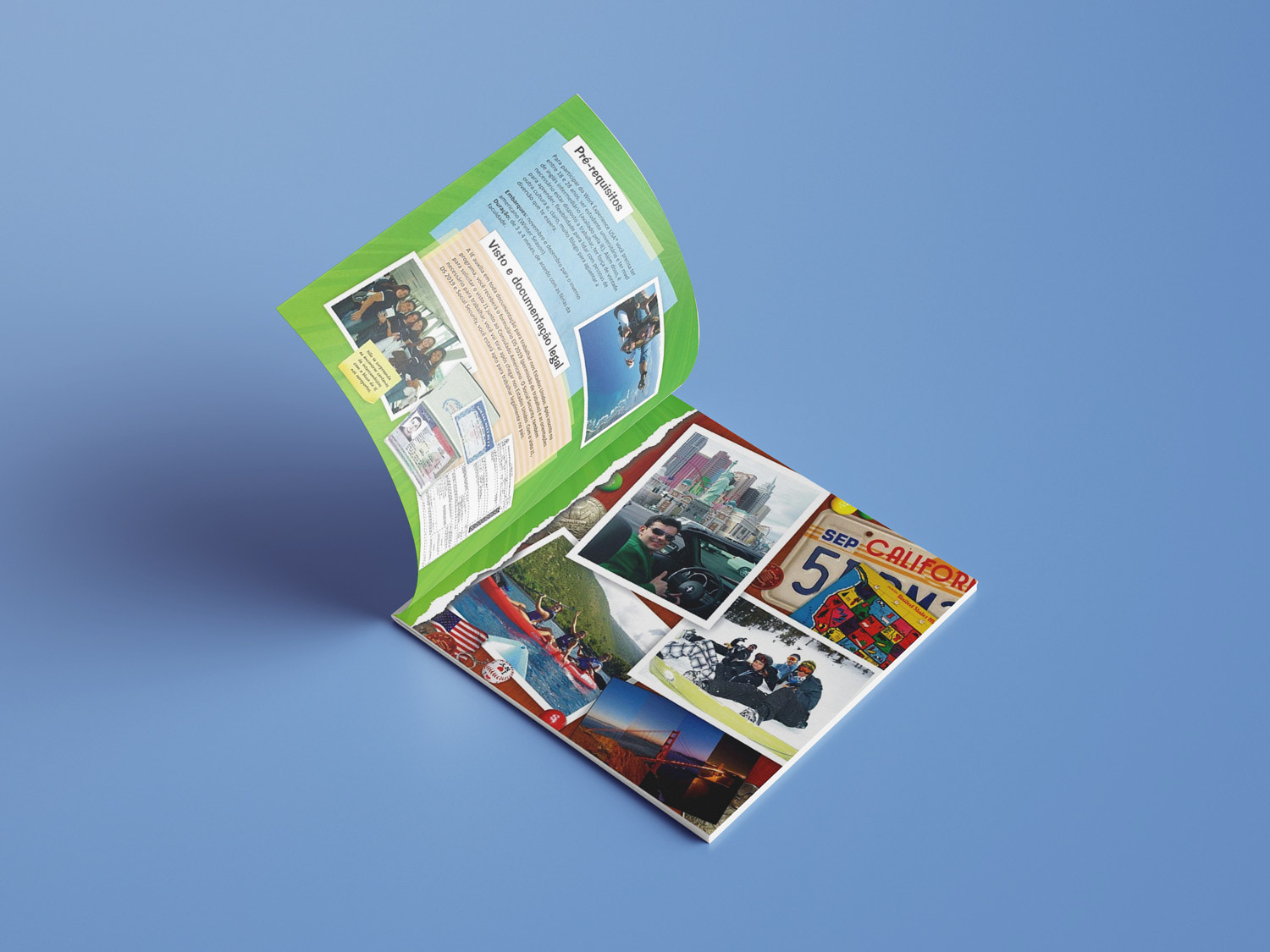
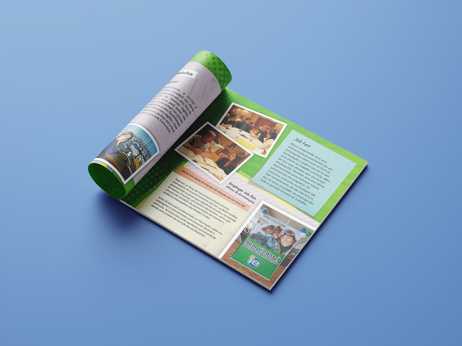
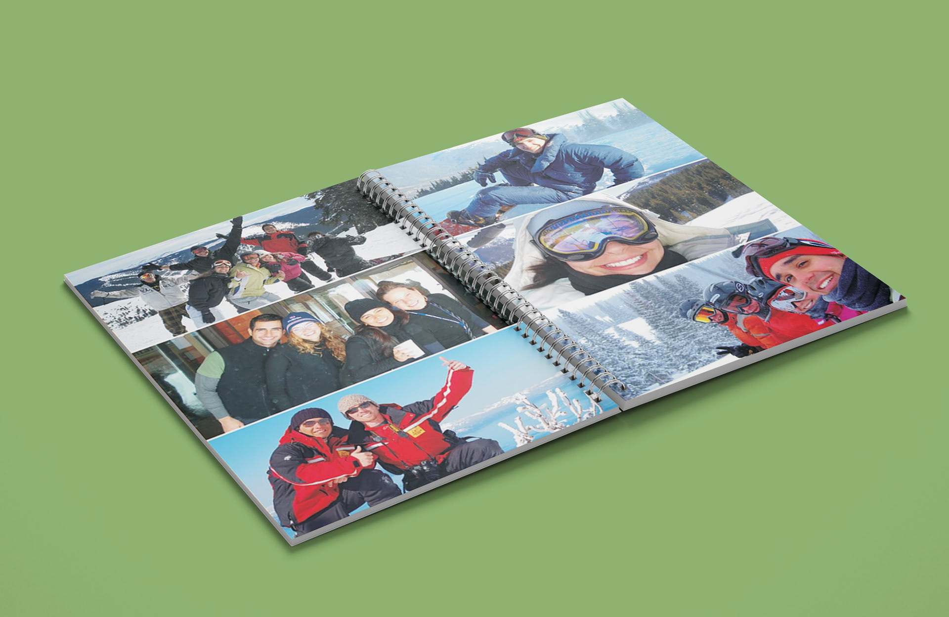
IE Book was a notebook handed to everyone who signed up for the Work Experience USA program in 2009. In its first pages it contained more information about the program, jobs, the country, the most wanted states by participants, curiosities, testimonies, other programs offered by the agency and lots of pictures of the country and people enjoying the program.

Brazilian students mostly picked ski resorts to work so they could experience the cold weather and go snowboarding, so I created a custom board for the cover with common things that exchange students did during their program written down on it and a pair of goggles.
The layout of the book was simpler and cleaner than the program's busy campaign, but I still applied some playful elements to keep the composition young and exciting for its young audience.


Trainee USA (2007)
This was the first material that I allowed to design myself from start to finish in my internship. A booklet for the new program offered by the company aimed to young people fresh out of university seeking a professional experience in their field in the States.
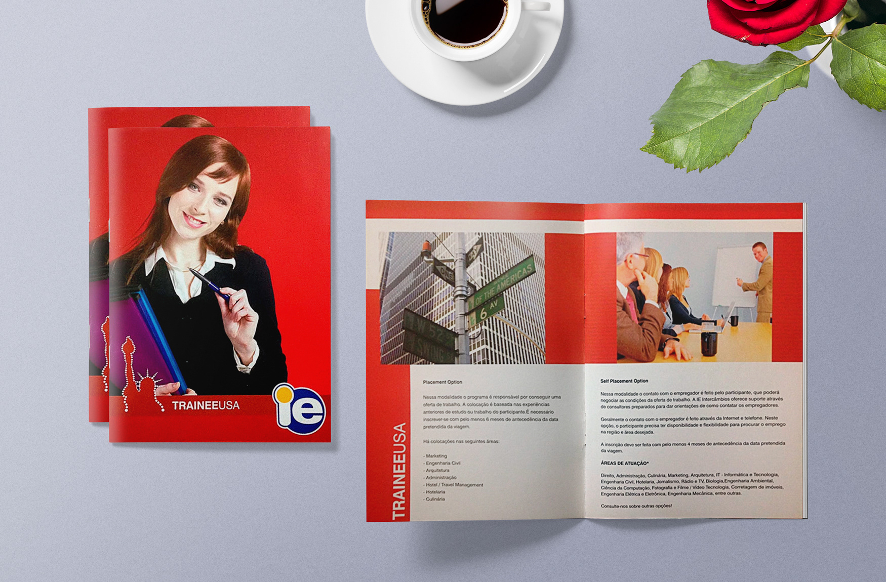
The layout was clean and elegant, with a professional and corporate feel, adopting simple shapes and fonts (Helvetica in different weights). The logo was the Statue of Liberty outlined by dots, representing the opportunities the program provided. The predominant color of the program's branding is scarlet red, to clearly distinguish it from the Work Experience USA's leaf green branding, and for being one of the colors of the American flag. The prices page was an insert due to fluctuating exchange rate and changes in payment conditions.
All the pictures were stock images depicting American big cities and corporate environments.

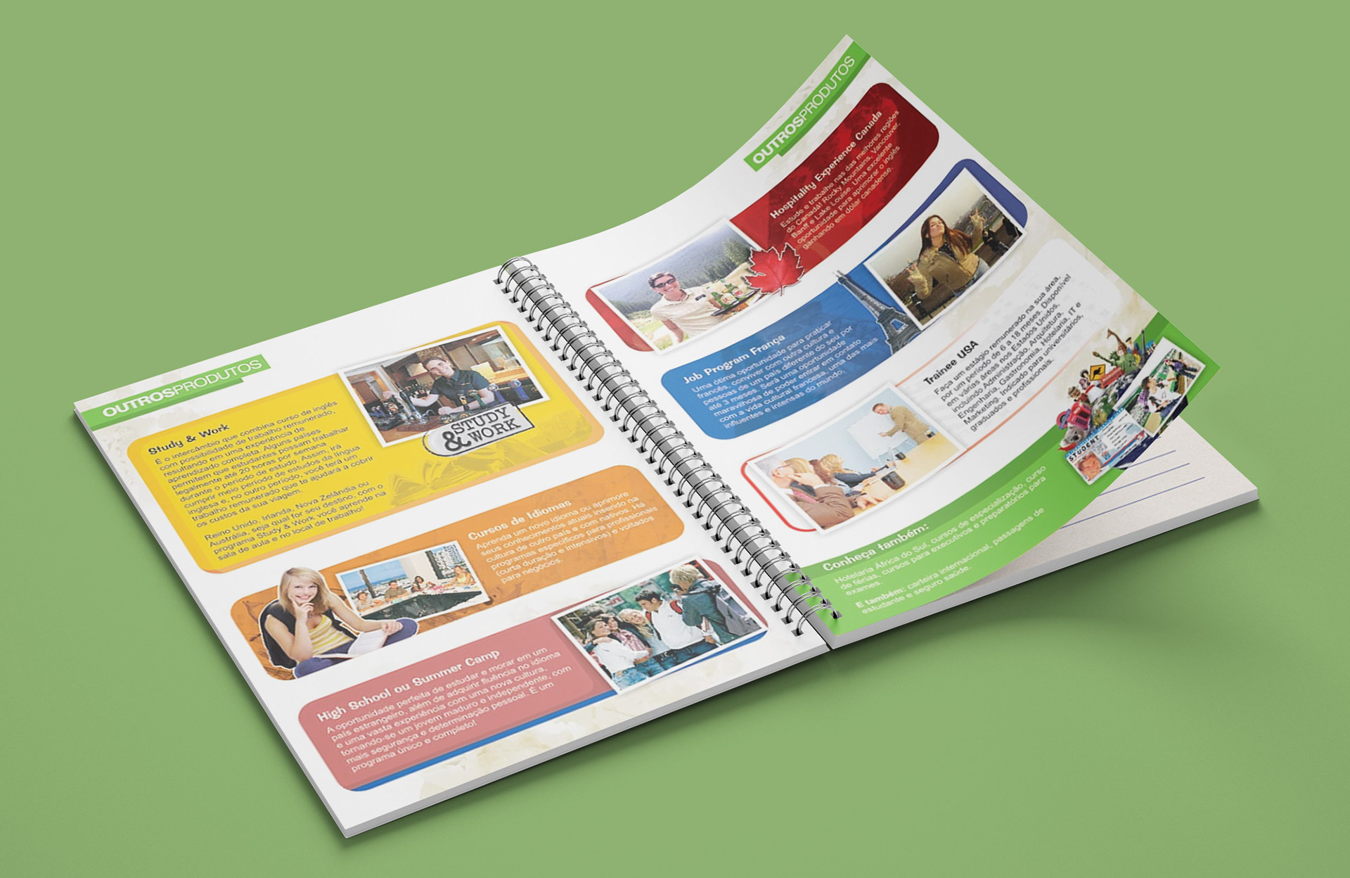
Other Pieces
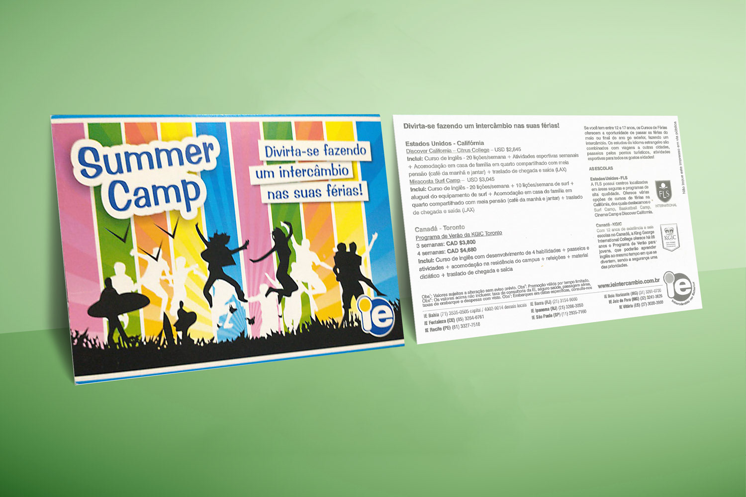
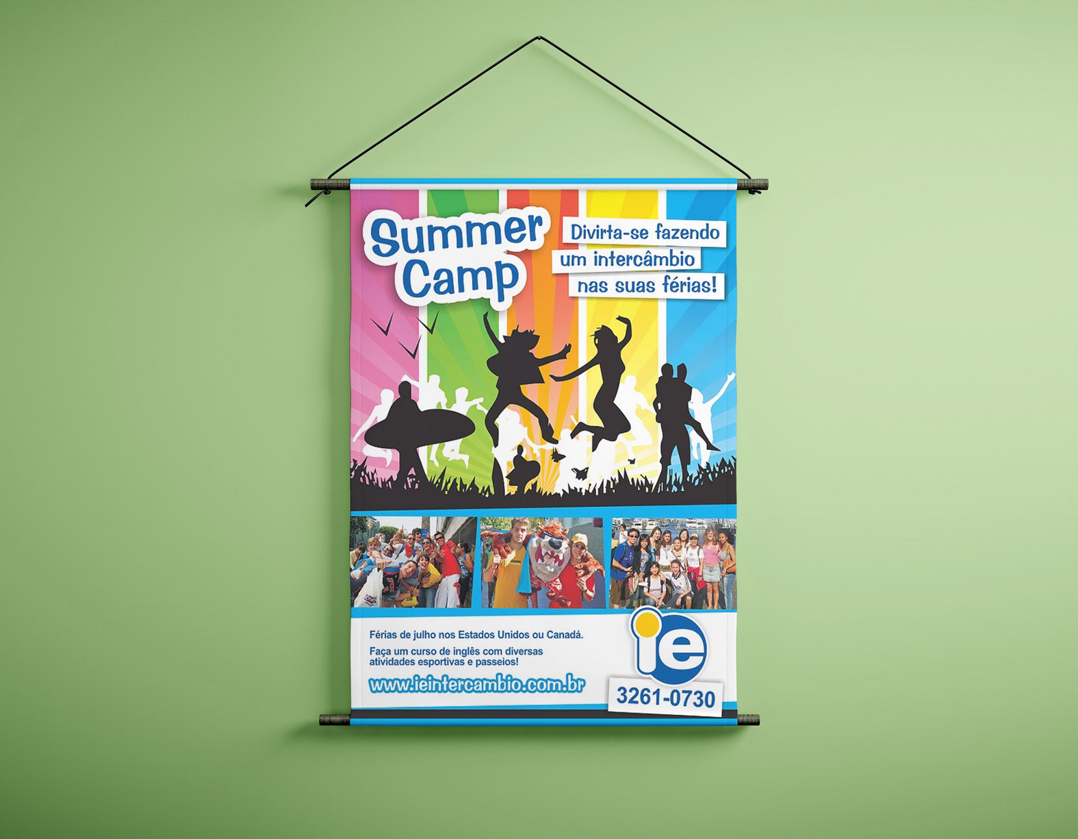
Summer Camp (2008) - Informative postcard handouts and banner/poster for Summer camps for teenagers from 12 to 17 years old in California or Toronto.
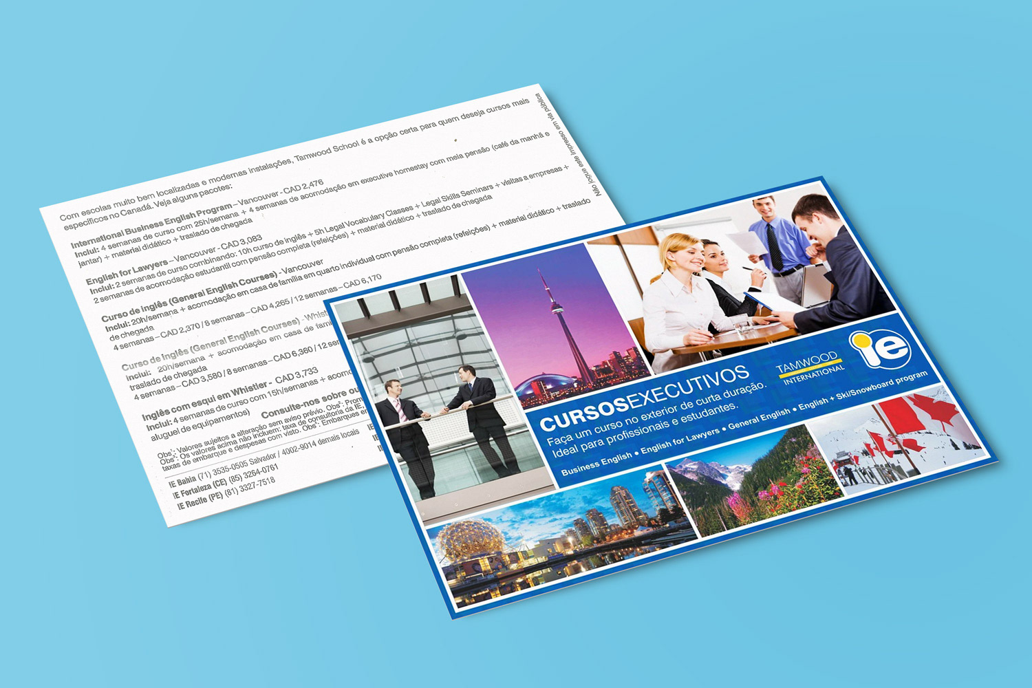
Cursos Executivos (2008) - Informative postcard handout for English and business courses for executives in Ontario or British Columbia.
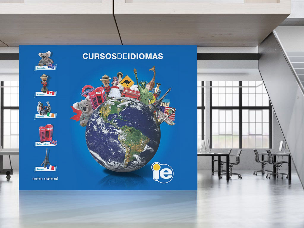
Cursos de Idiomas (2008) - Visual identity for the language courses sector of the company, applied to wallpapers, flyers, handouts, newsletters, etc.
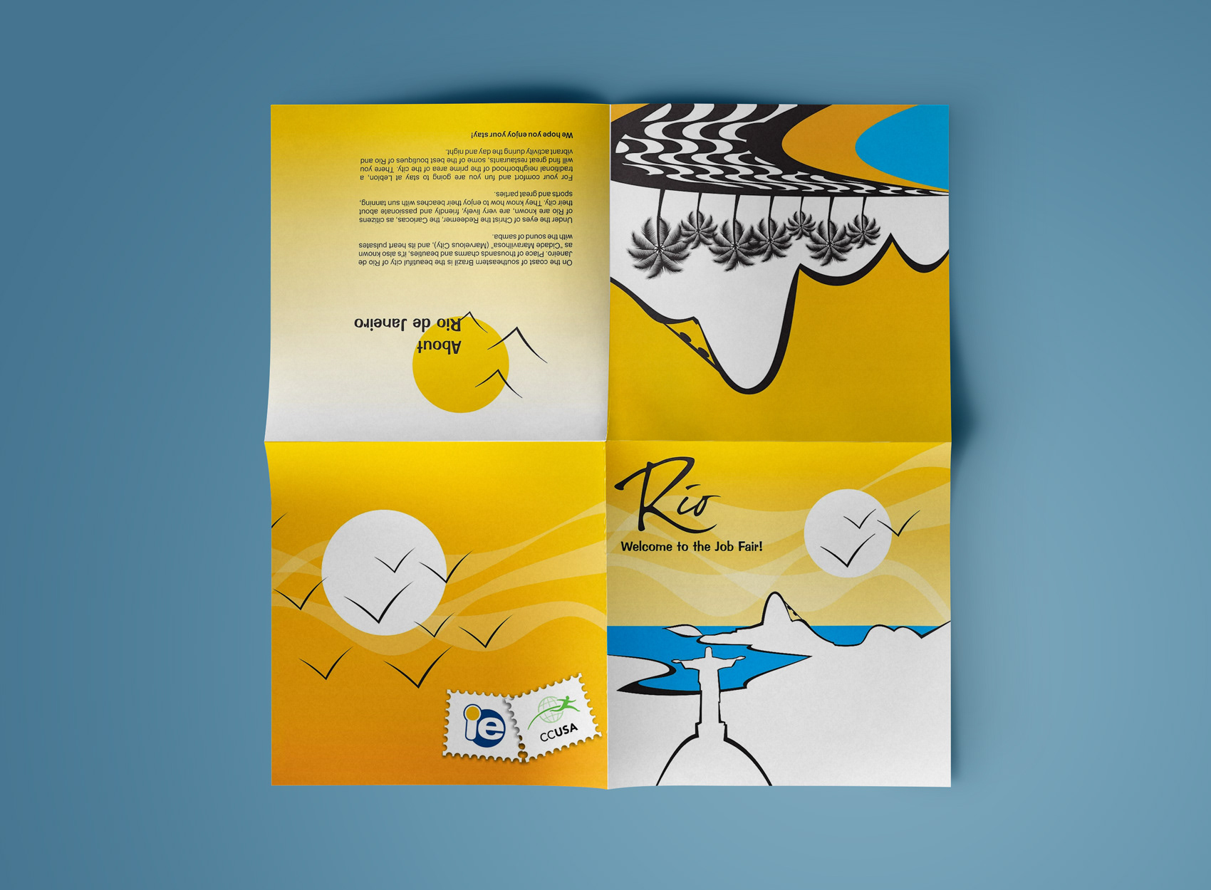
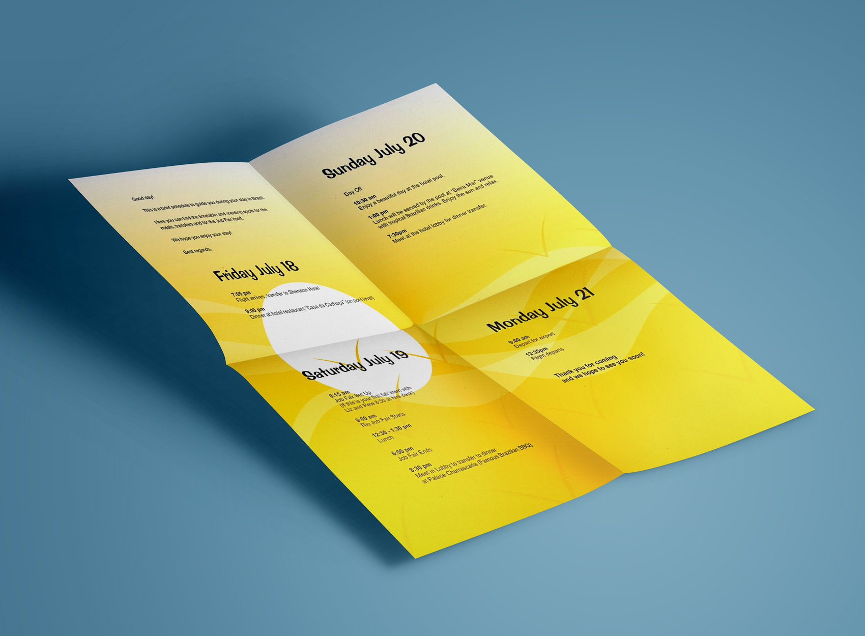
Welcome Letter (2007) - Letter handed to American employers visiting Rio de Janeiro for the Work Experience USA job fair with the complete trip schedule.
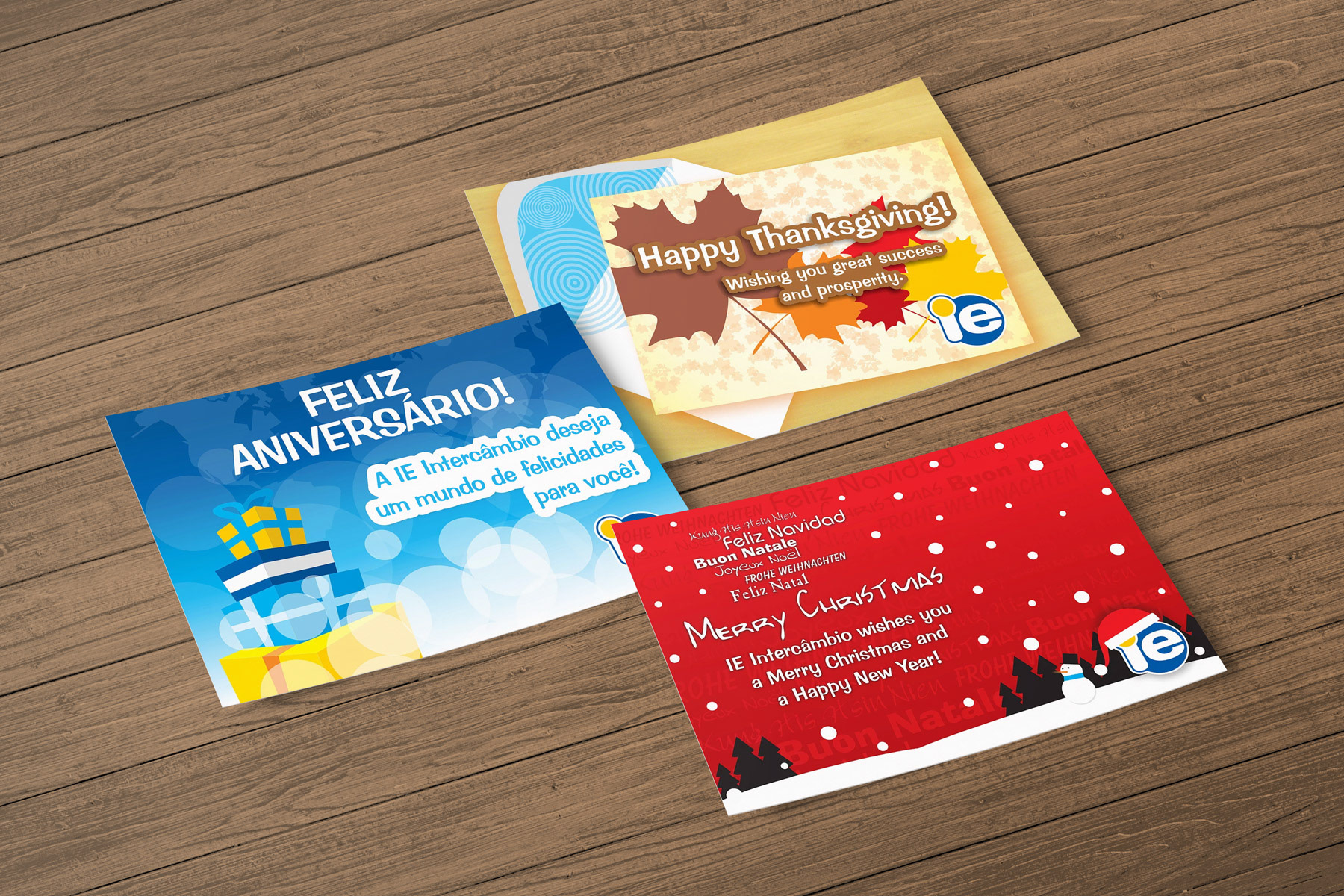
Postcards (2007-2009) - Holidays and birthdays postcards mailed or emailed to costumers and partners on special occasions.