DARE ▪ Marketing Package (2020)
DARE is a clothing store focused on casual attire (outwear, underwear and swimwear) for teenagers and young adults. Some of its competitors are the GAP, Old Navy, American Eagle and Urban Outfitters. For the Spring/Summer collection, the feel should be outdoorsy and playful, using vibrant and saturated colors.

Full page ad layout
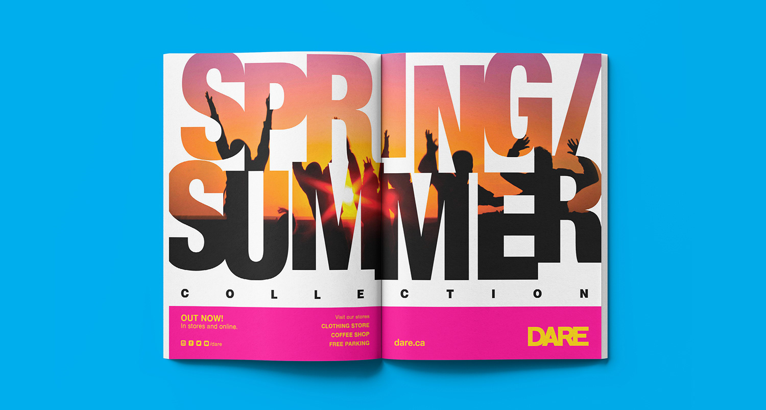
Two-page ad layout
All layout work crafted on Adobe InDesign, image compositions edited and enhanced on Adobe Photoshop. Font used is Helvetica, for being a simple and traditional typeface that can also be very current. The use of different styles and weights of the typeface keeps the composition young and playful and clearly establishes hierarchy.
Logo uses the typeface Sematary.
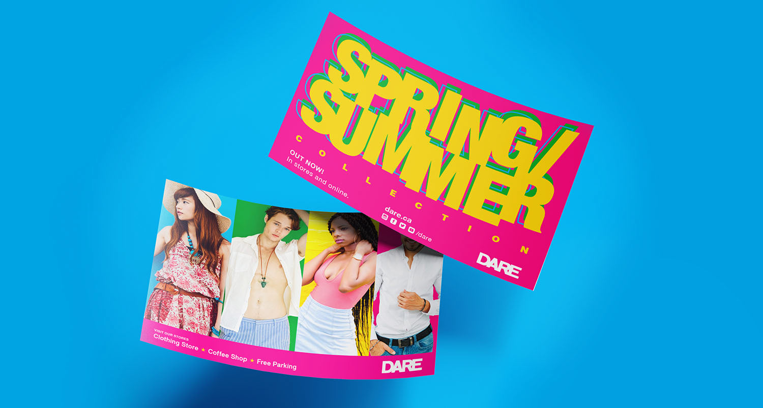
Handout flyer layout

Facebook Profile
Primary colors used are magenta and canary yellow, for being hot saturated colors that represent youth, the florals of Spring and warmth of Summer. Secondary colors are sky blue and shamrock green, to the keep the composition colorful and young.
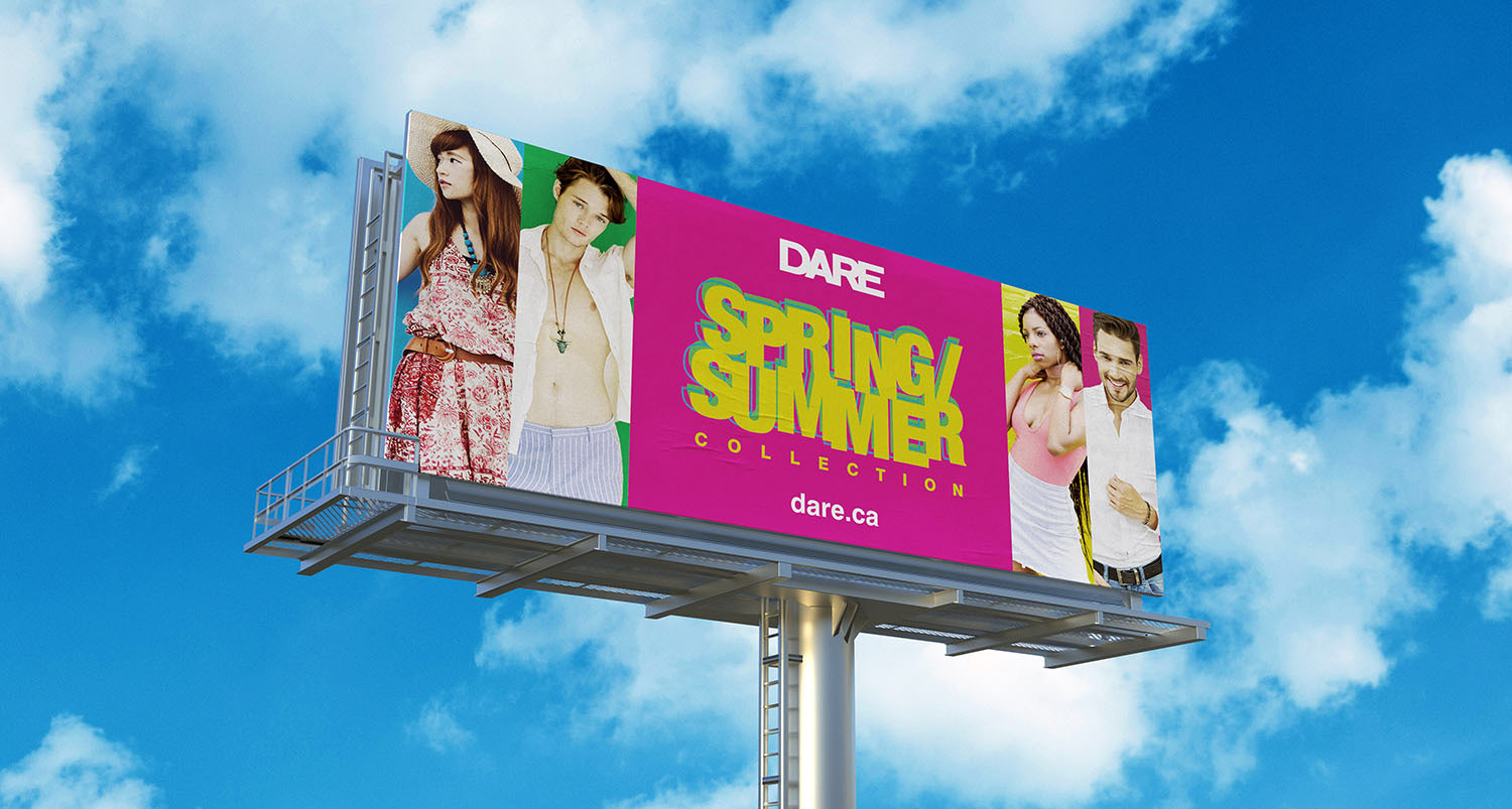
Outdoor layout

Poster layout
All mock ups created on Adobe Photoshop.