CMR ▪ Law Firm Branding (2020)
CMR (Couto Madeira Rechembach) is a law firm from Maceió, Brazil formed by three female attorneys. My clients needed branding, a logo and a complete professional stationery to start their business. In the near future they plan to create a website and social media profiles to further advertise their practice.
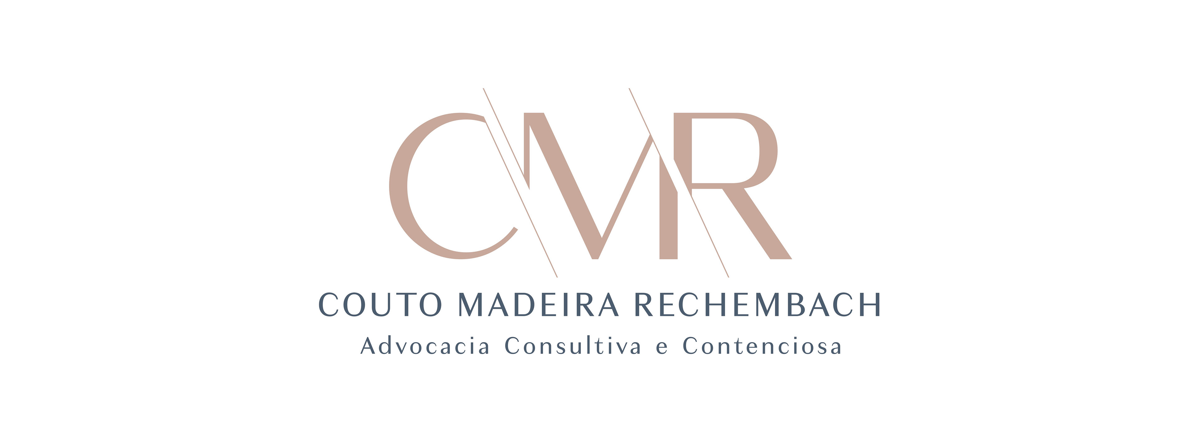
Logo
For the logo, they wanted a simple, elegant and delicate logotype that could reflect unity among the three partners and avoid the use of symbols or brandmarks. I used a humanist sans serif typeface called Granville, which conveys the characteristics they were looking for. The thin lines crop the letters diagonally making it possible for them to interact with each other applying the Gestalt closure principle, representing their bond, while still not touching each other, as each character represent one partner and they are strong and independent individuals on their own.
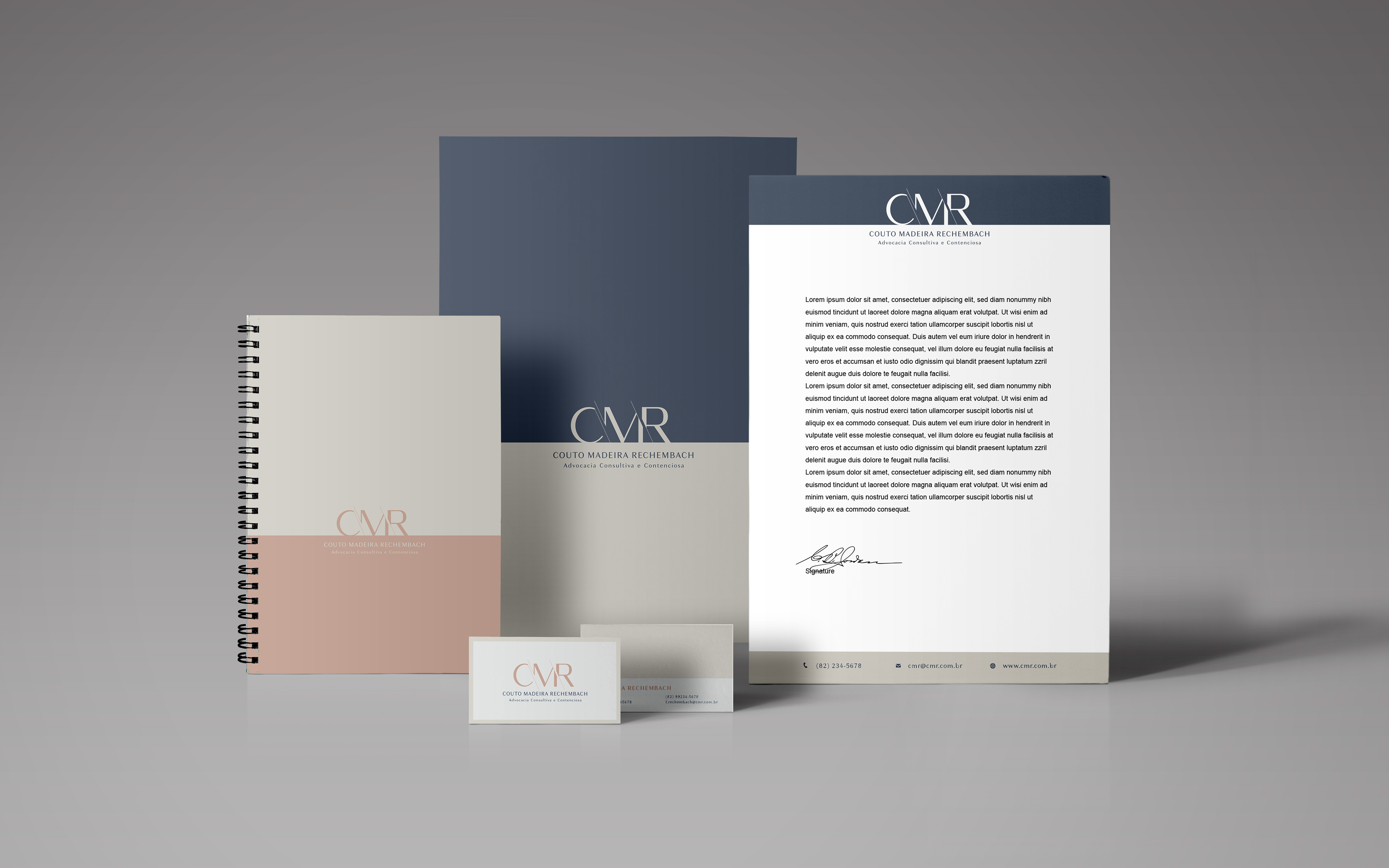
Appointment book (A5), business cards, folder for A4 sheets and letterhead (A4).
The color palette chosen for their firm is composed by tints and shades of rose gold, dark blue and beige, as they are sober and serious colors that transmit modernity, elegance and delicacy.

Open folder with letterhead and business cards.

Large envelope for A4 sheets.

Interactive PDF business cards for online sharing.
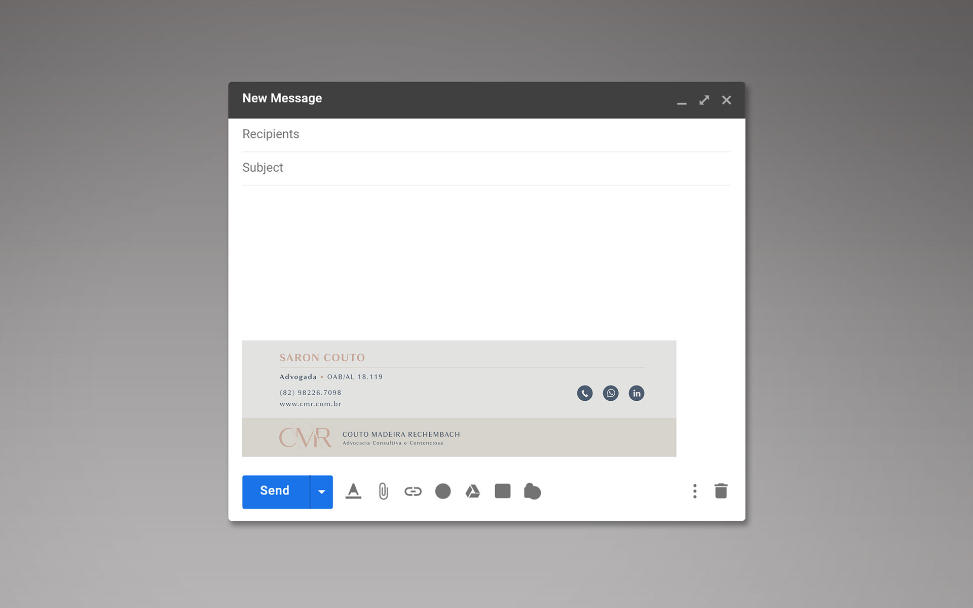
Email signature
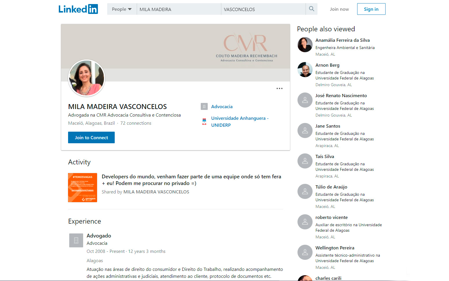
Linkedin Banner