
AccuRadio ▪ UI Re-Design (2020)
AccuRadio started as an online radio with unique and diverse channels, and eventually developed its own app. Its app is very outdated and displays some UI issues. The goal of this project is to propose a fresher, more current visual to the app and also improve its usability. The video advertisements focus on quarantine workout playlists.
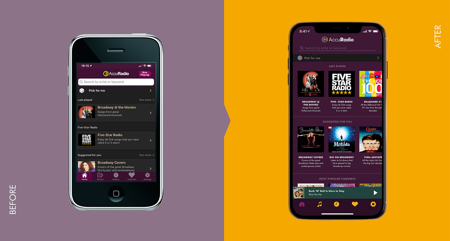
Home screen
Home screen was changed from only scrolling up/down to incorporate horizontal swipes, which keeps the user in the same screen longer and eliminates the use of "see more" links. The light orange color of the new logo was used in the icons on the bottom of the screen to create more contrast. "Now Playing" button was substituted to a player bar, which allows the user to resume or pause the music without leaving the current screen. The use of the dark purple throughout the whole background keeps the design simpler and cohesive, maintaining the brand identity. Search bar updated to create less contrast and keep the focus on the playlists and bottom menu.
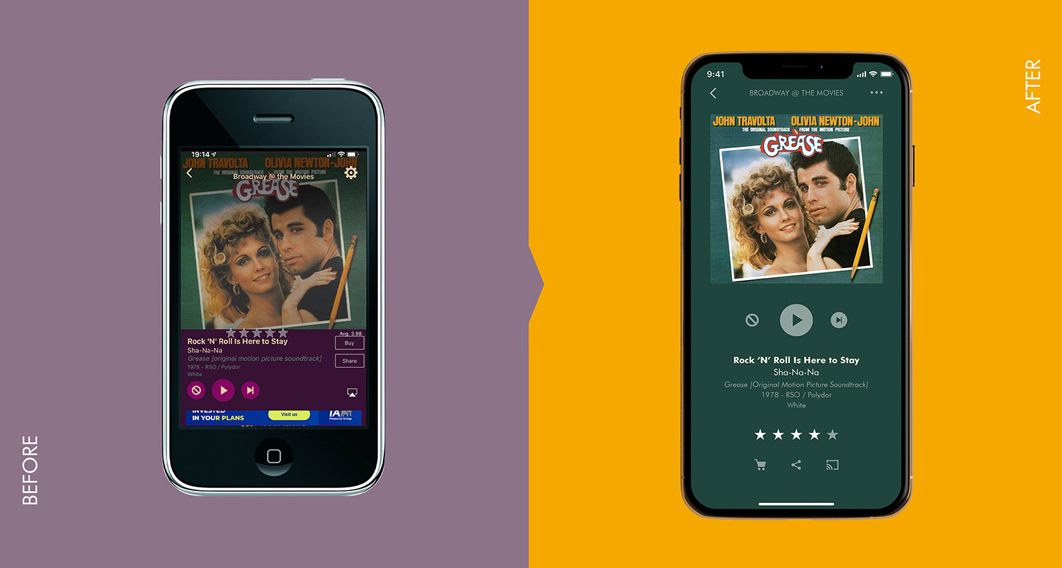
Player screen
Player screen reorganized to make it simpler and clearer. Buttons like "Buy" and "Share" changed to easily recognizable icons, to minimize the use of text. Background uses a darker tone of the most prevalent color in the album cover, so the search bar in other screens can contrast with the rest of the interface.

App kit
App icon updated to the new logo. Typeface changed from a grotesque sans-serif to Futura, which is used in the new logo and makes the interface look less standardized and more current and fresh. Icons redesigned to create more unity in style. Main brand colors maintained.
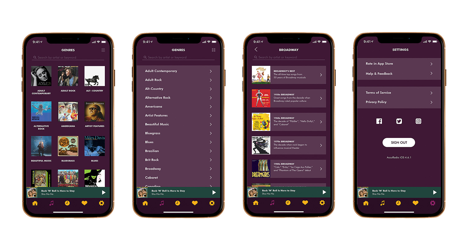
Genre screens (Album view and list view), Sub-genre screen, and Settings screen.
Genre screen can be displayed both in "list view" or "album view", at the user's discretion.
Advertisement videos for mobile apps and social media stories:
All artwork created on Adobe Illustrator and videos edited on Adobe Premiere.