AAU Musical Revues (2014-2017)
San Francisco's Academy of Art University (AAU) provides voice and musical theater classes in its Motion Pictures and Television department and School of Acting. As an instructor in this program, Cynthia Rogers Baggott presented a musical revue at the end of each semester. I was one of her former students, and being a designer, we formed a partnership whereby I created a poster for each of her revues.

Broadway Mickey (2014)
Disney Broadway musicals was the theme. The show was young and upbeat. With a format inspired by the TV show The Mickey Mouse Club, I took reference from that program to create a colorful and "bubbly" design. Each of the starring cast members was presented in bubble shapes that form a Mickey Mouse head silhouette and used typical Disney typefaces.
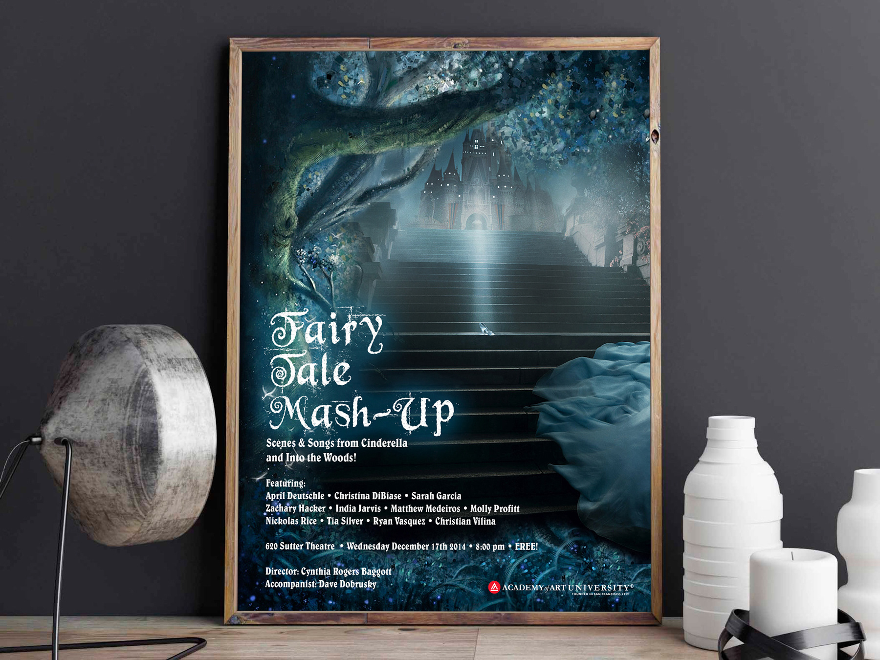
Fairy Tale Mash-Up (2014)
Fall 2014's show was based on the fairy tale musicals Into The Woods, by Stephen Sondheim, and Cinderella, by Rodgers and Hammerstein. One of Cinderella's most iconic moments is when she flees the ball leaving her glass slipper behind. I used that scene to portray Cinderella running away from the palace "into the woods", integrating the two shows. The title's typeface is Beyond Wonderland, a typeface that fits the composition well, using some glow effects to represent the typical magic and mysticism of fairy tales. For the show's info I used Belwe, an old-style serif typeface that is legible but resembles blackletter, which is also commonly associated with fairy tales.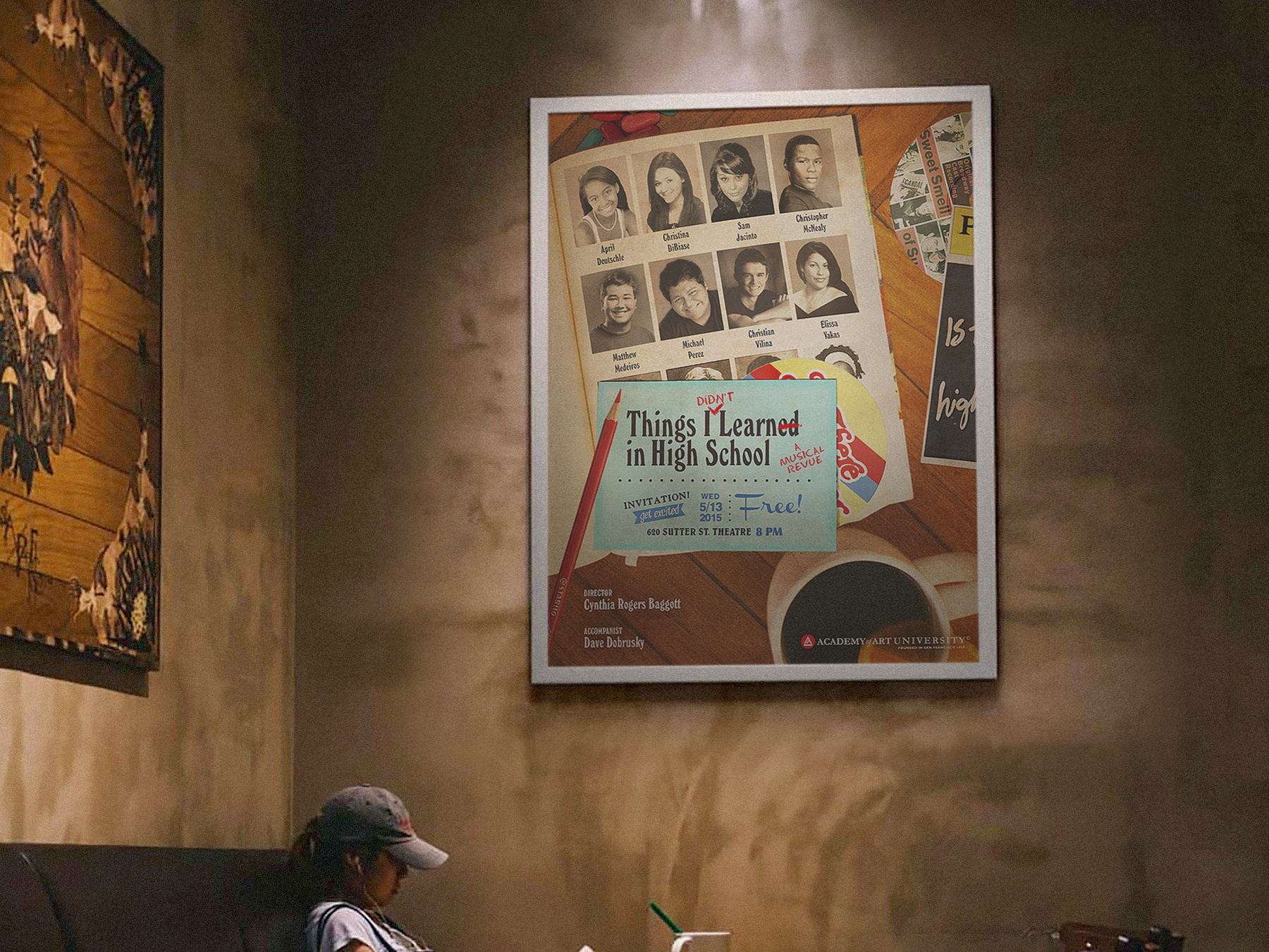
Things I Didn't Learn in High School (2015)
The Spring 2015's student show was based on Craig Carnelia's musicals Sweet Smell of Success and Is There Life After High School. The idea behind the design was a messy teenager's bedroom floor, while he/she goes through the school's yearbook. The yearbook presents the students starring in the show.
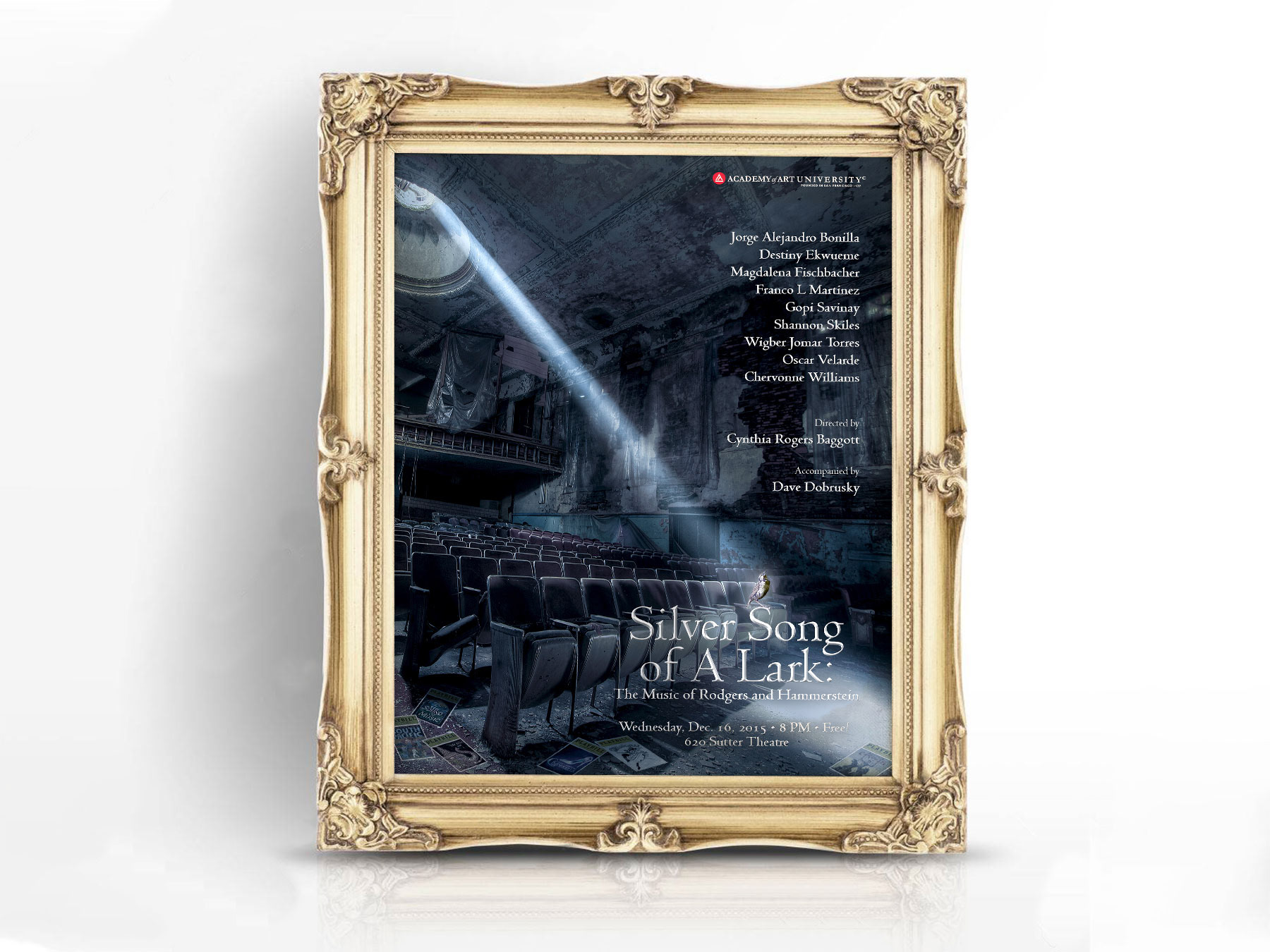
Silver Song of a Lark (2015)
'Silver Song of a Lark' are lyrics from "You'll Never Walk Alone", a show tune from Rodgers and Hammertein's Carousel. The show is about an old theater set for demolition and a group of actors who used to work there perform their favorite Rodgers and Hammertein's songs one last time. The iconic Broadway duo's work is refined and classic and requires an elegant serif typeface to portray that, therefore I used Jenson Classico. The image depicts an old, dark theater, just like the one in the revue, with old playbills from their shows on the floor. A sliver of light comes from the ceiling revealing a lark singing on top of the show's title. All the text is colored "silver" and has metallic effects applied to it.
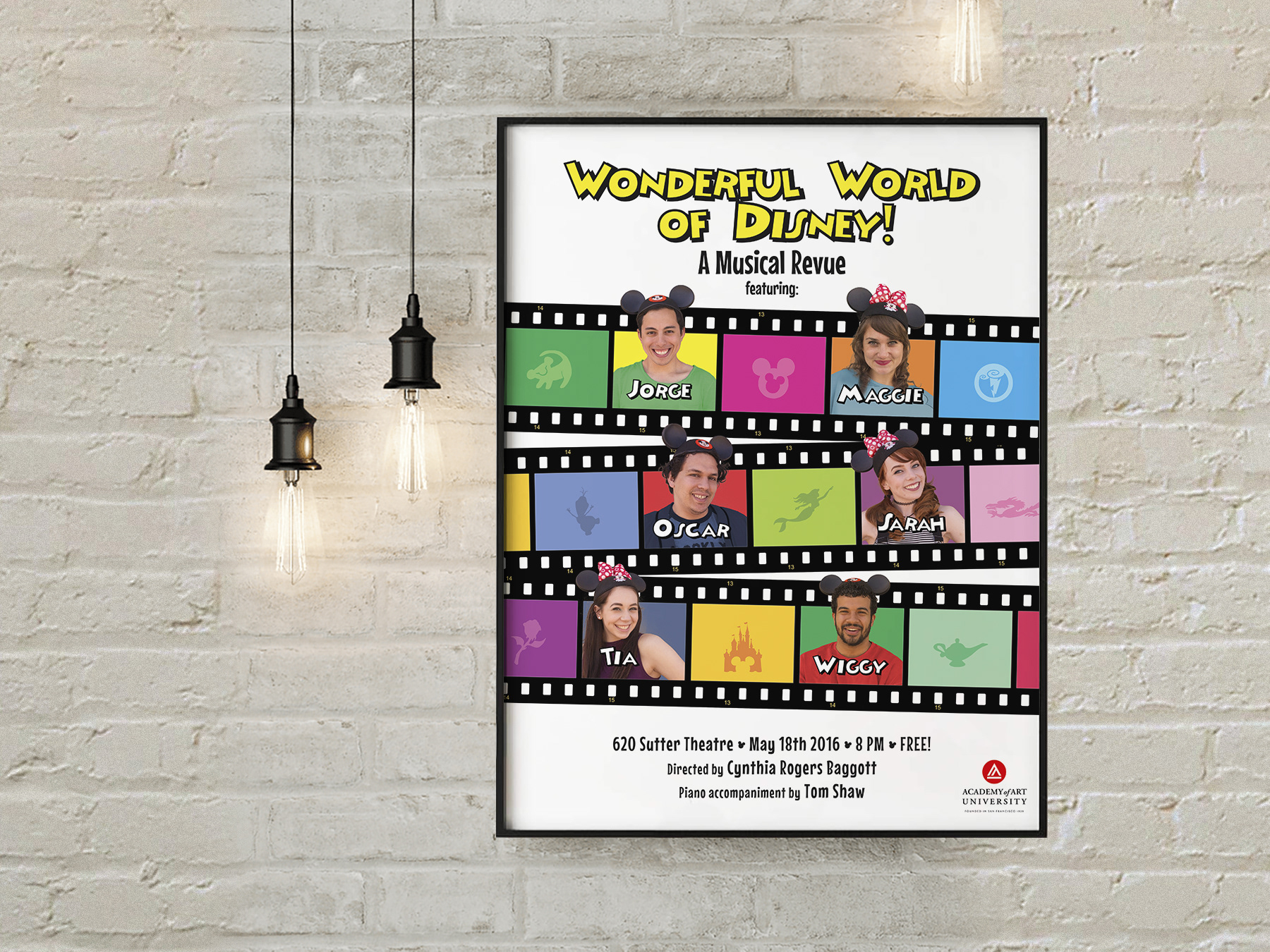
Wonderful World of Disney (2016)
Since Broadway Mickey was a popular show among students, in the spring of 2016 it was revived with a new title. This time its focus wasn’t simply Disney stage musicals, but also Disney animated features. The idea was to take advantage of the previous show's popularity and do something similar. I retained most of the original idea, but instead of using the bubble shapes forming a Mickey Mouse silhouette, I used film strips to project the new theme. I also added famous Disney characters and elements in the empty frames.
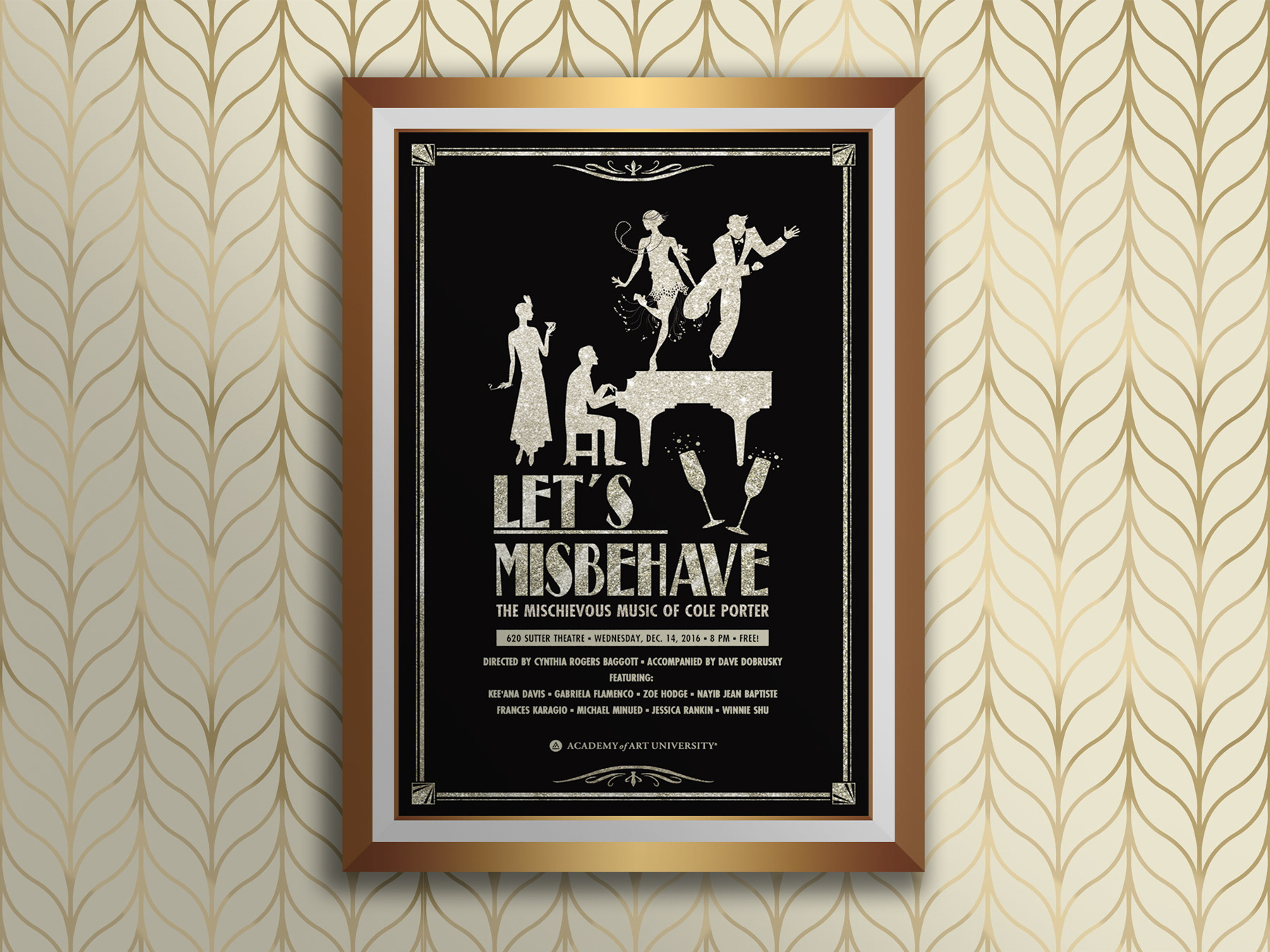
Let's Misbehave (2016)
The songs of Cole Porter were the subject of the Fall 2016 show. Most of Porter's shows were pre-Golden Age (1920s, 1930s and 1940s). Cynthia wanted to portray a fancy early 20th century high society party, so I drew inspiration from The Great Gatsby. I created an Art Deco inspired poster with shiny elements on a black background, to convey class, refinement and exuberance while also making the time period clear. 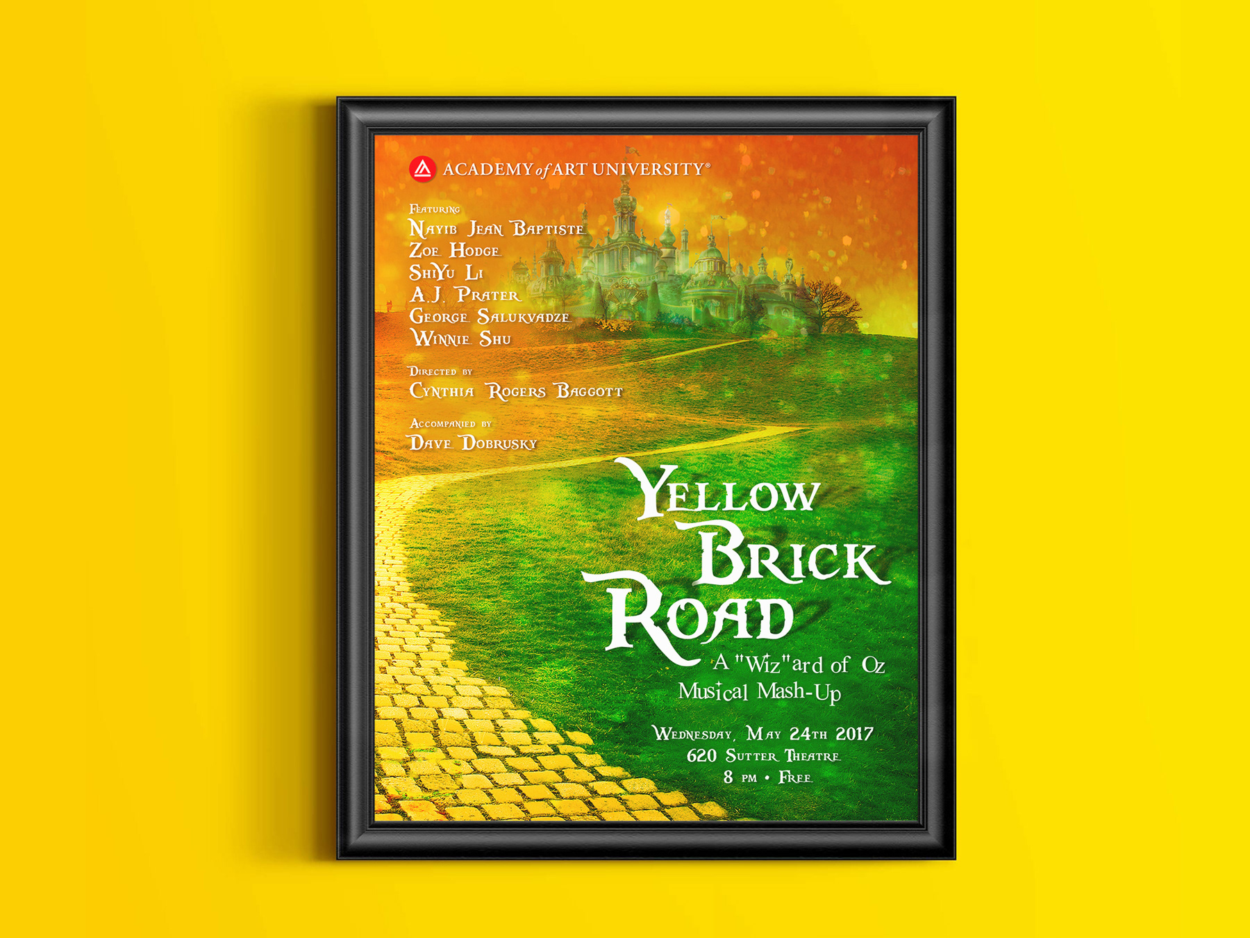
Yellow Brick Road (2017)
The "mash-up" for Spring 2017’s student show consisted of The Wizard of Oz, Wicked, and The Wiz. This was a very simple project to conceptualize, the title says it all. I just created a Photoshop collage of images to show a yellow brick road leading straight to the Emerald City. I used shiny/glittery yellow and green textures to give the composition an ethereal and magical feel, which suits the subject. I used the display typeface Pieces of Eight, because it’s reminiscent of old fantasy/adventure films and plays. For the subtitle I used New Romantics, because of its playful kerning and sparkly elements.
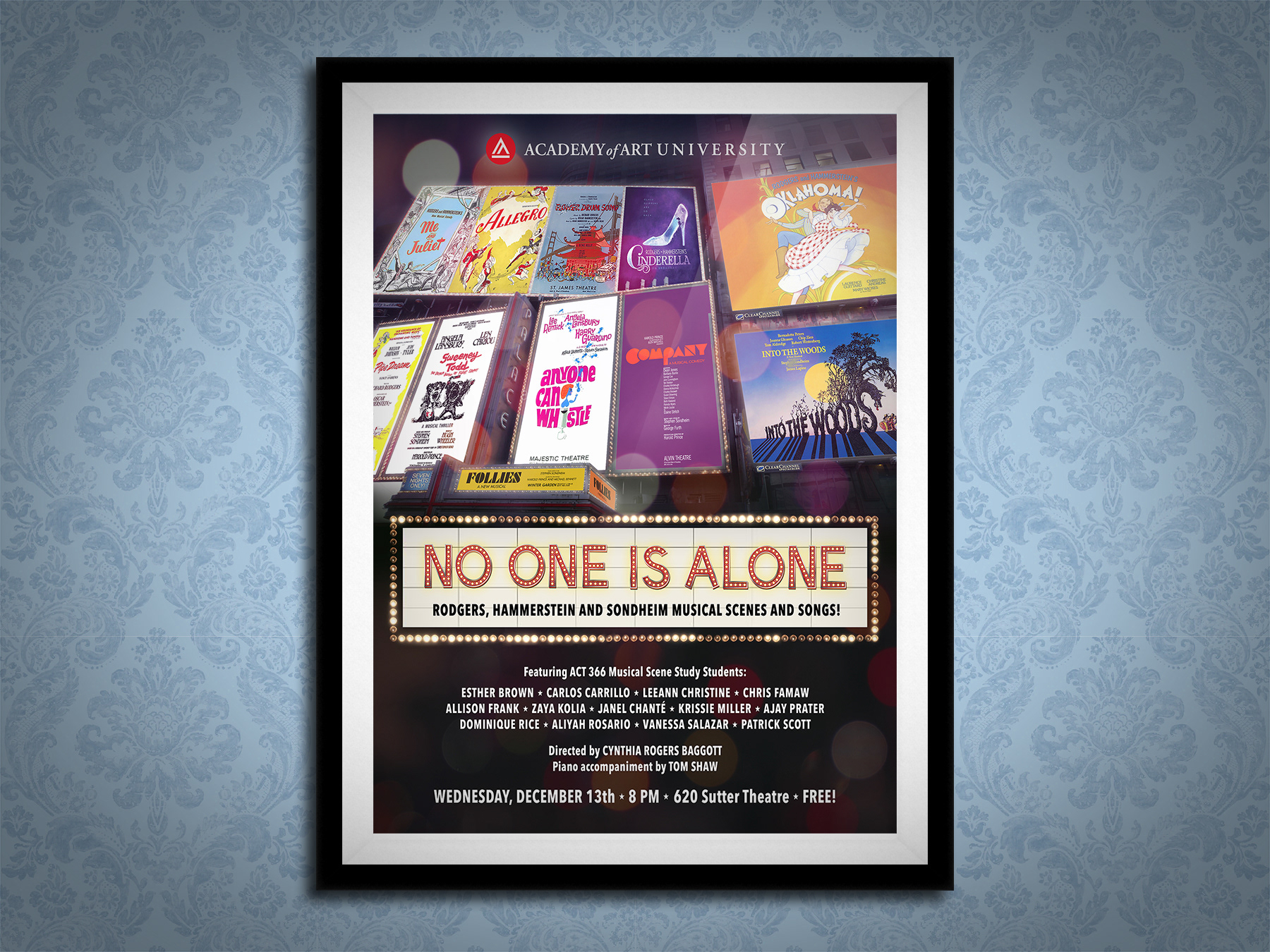
No One is Alone (2017)
As it says, this show comprises scenes and songs from Rodgers, Hammerstein and Sondheim musicals. As three of the most prolific Broadway composers of all time, my idea for this poster was a big old-style theatre marquee and billboards with their shows featured in the revue. For the text, I used Avenir to keep it as simple and legible as possible.
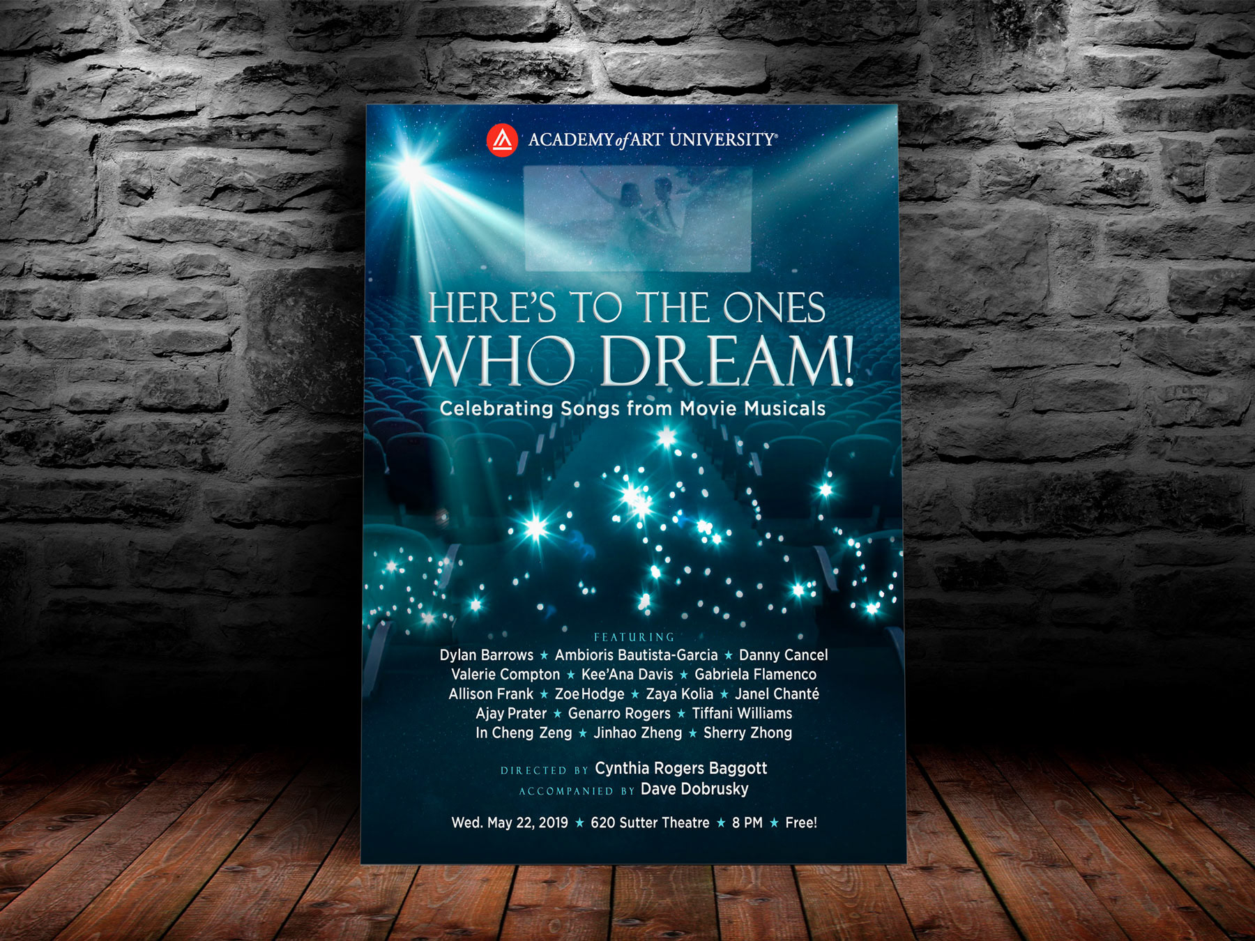
Here's To The Ones Who Dream! (2019)
This was the last poster I completed for AAU as Cynthia left the program soon after that. For this show about movie musicals, I designed a movie theater where La La Land is being presented. 'Here's To The Ones Who Dream' are lyrics from one of the film's songs. A spotlight evokes the possibility and manifestation of dreams. Typeface used for the titles and sections is Felix Titling, as it is an all caps serif font that resembles the fonts used in movie posters (such as Trajan). Avenir, a Humanist sans-serif that improves legibility, is used for the subtitles, personnel and event information.